

The Project
RabbIT Solutions is a modular compliance platform that helps regulated businesses move fast without friction. The identity is built around that idea.
The rabbit, fast, alert and always a step ahead, inspired the mark: the letter R with an angled stroke that reads both as a rabbit’s ear and as an arrow pointing forward. Deep navy brings trust and stability, while electric green signals speed and the moment a check is approved.
✲ Colours
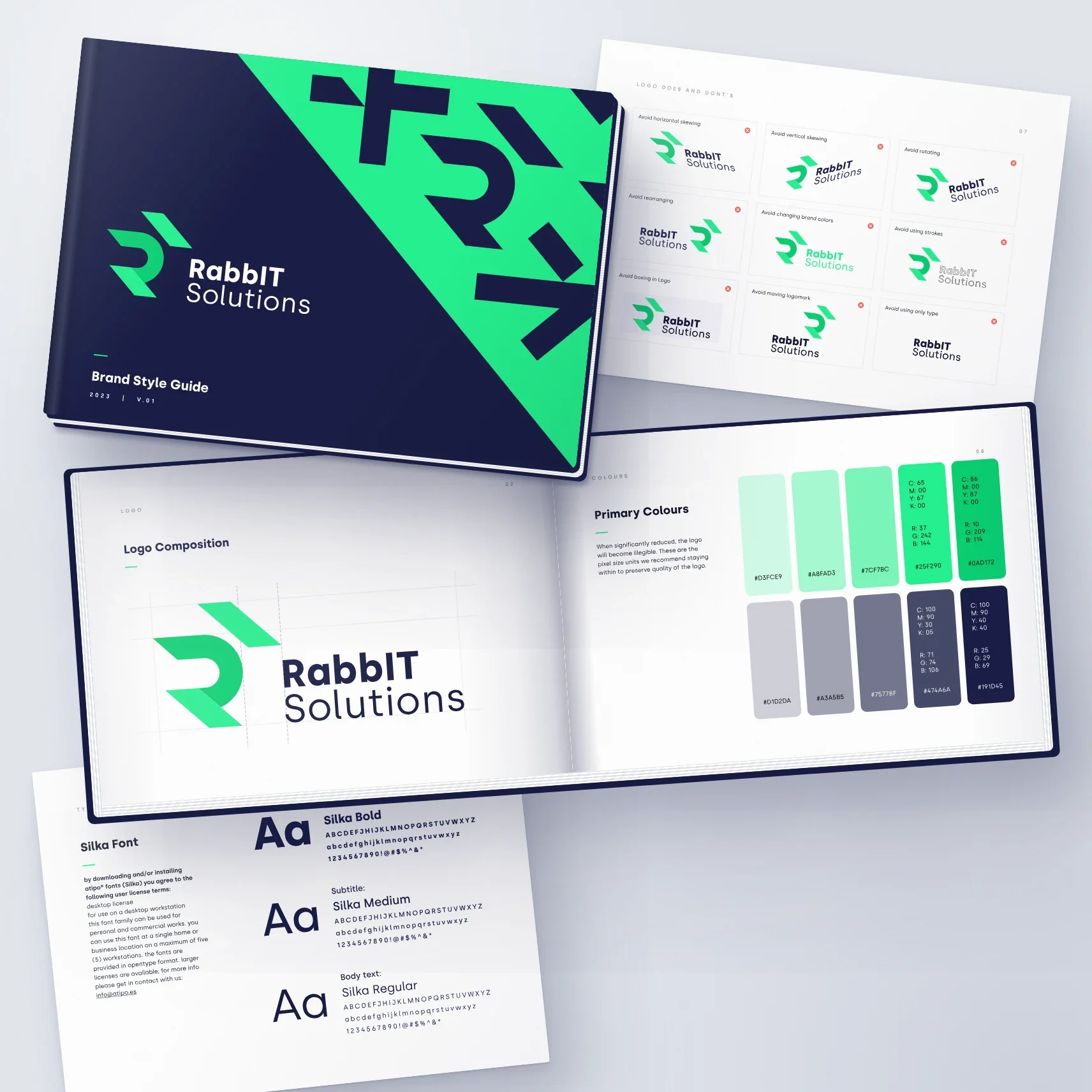
The palette is built around two anchors: electric green and deep navy. A scale of lighter greens, adds depth and flexibility, while soft greys keep layouts calm and readable. Every colour is defined in CMYK, RGB and HEX for consistent results in print and digital.
✲ Shapes & Icons
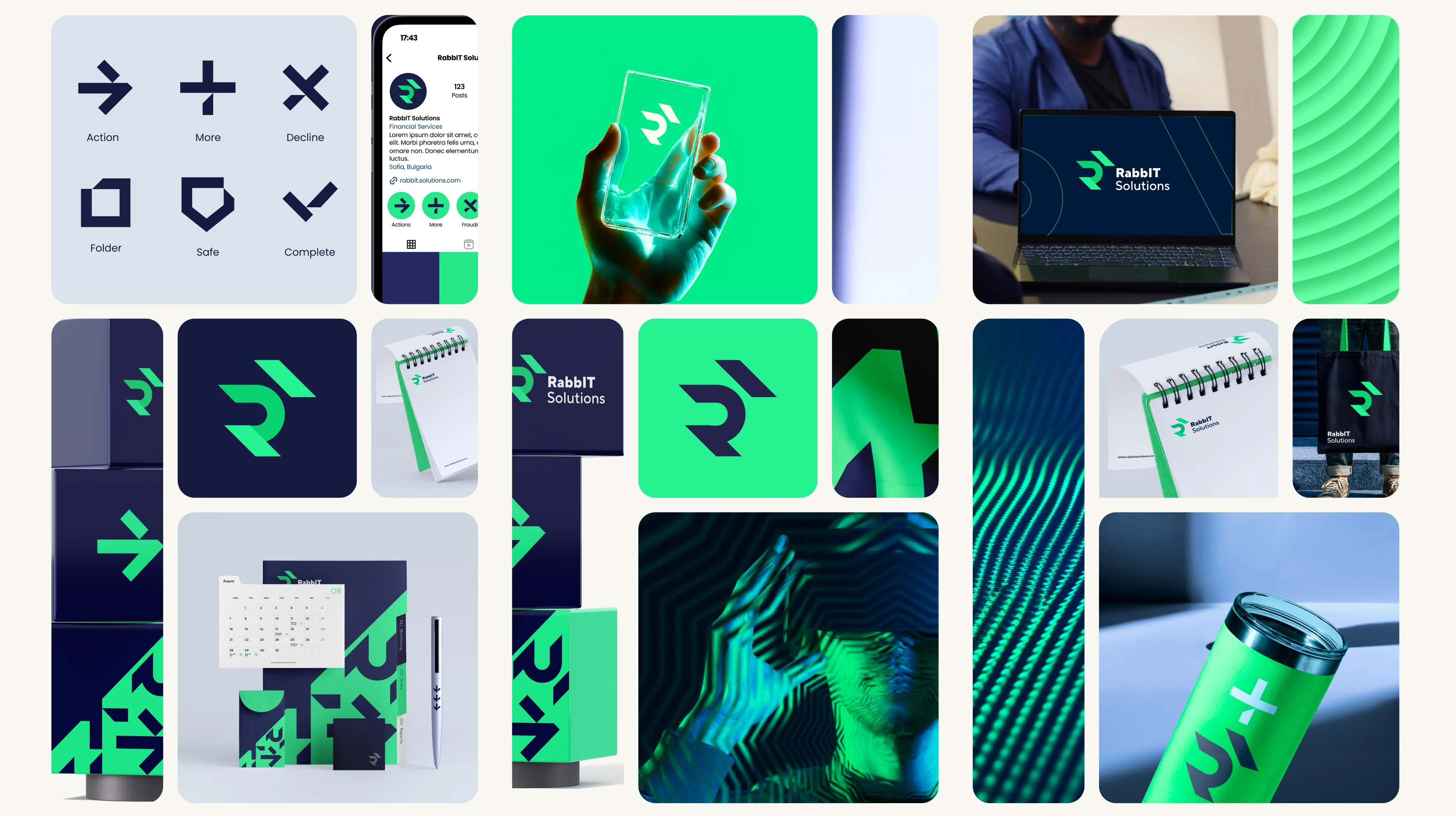
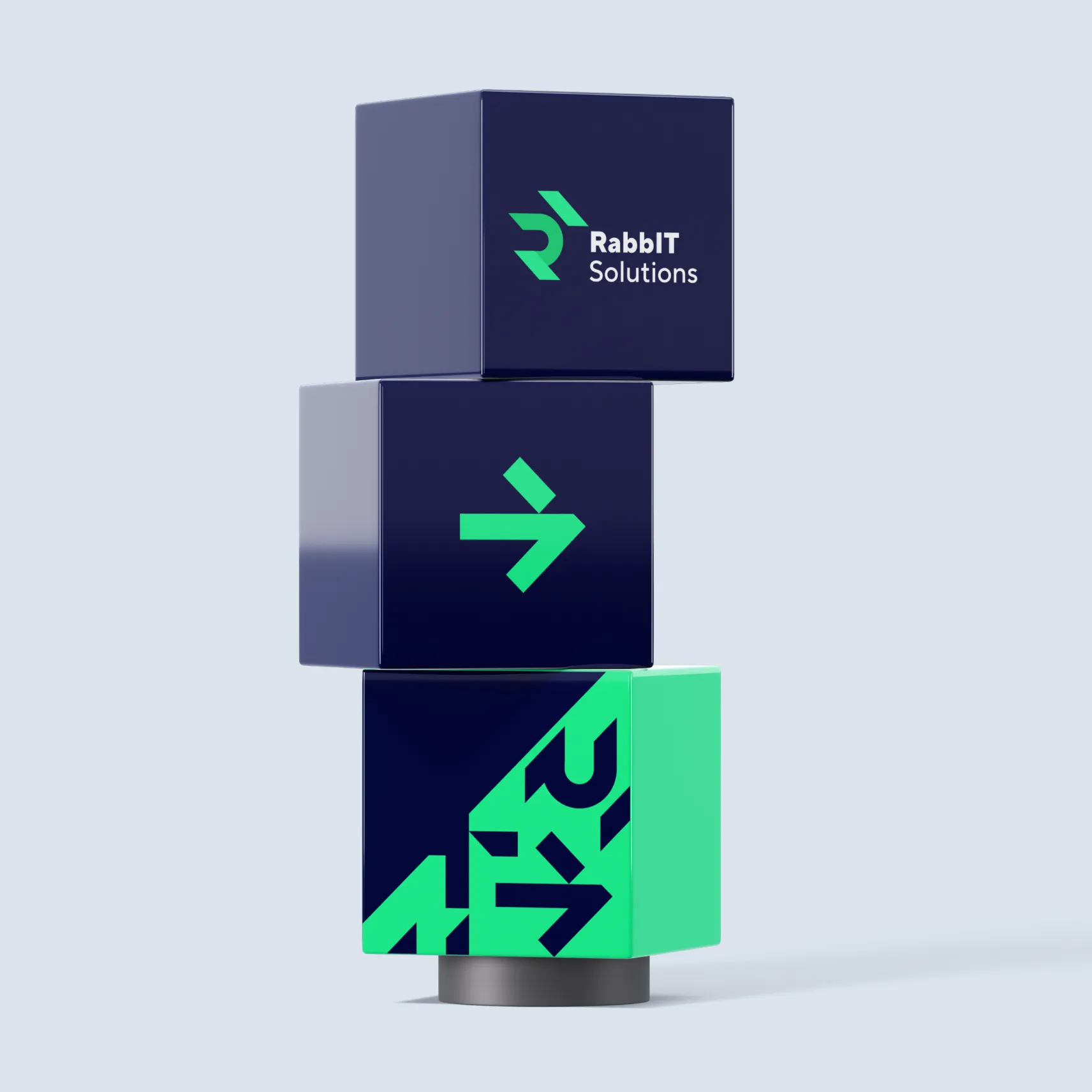
The angled forms of the logo were broken down into a set of graphic elements: arrows, crosses, ticks and fragments of the R. Combined, they create bold, recognisable patterns. Simplified, they become a custom icon set for actions like approve, decline, protect and report, linking the brand directly to the product.
✲ Typography
Silka, a clean geometric sans-serif, carries the brand across every touchpoint. Its Bold, Medium and Regular weights create a clear hierarchy for titles, subtitles and body text, matching the precise, modern character of the logo.
✲ Brand Style Guide
Everything comes together in a complete brand book. It defines the logo construction, clear space, colour values, typography and the rules for how not to use the logo, so the identity stays consistent as the company grows.


A System Built on Motion
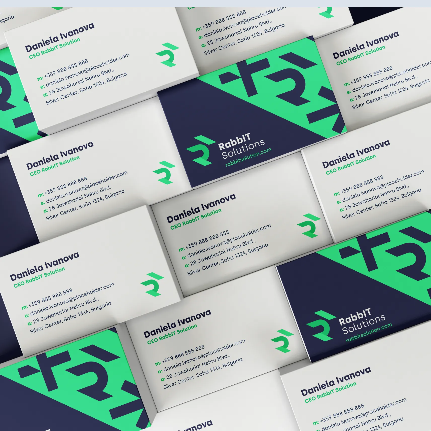
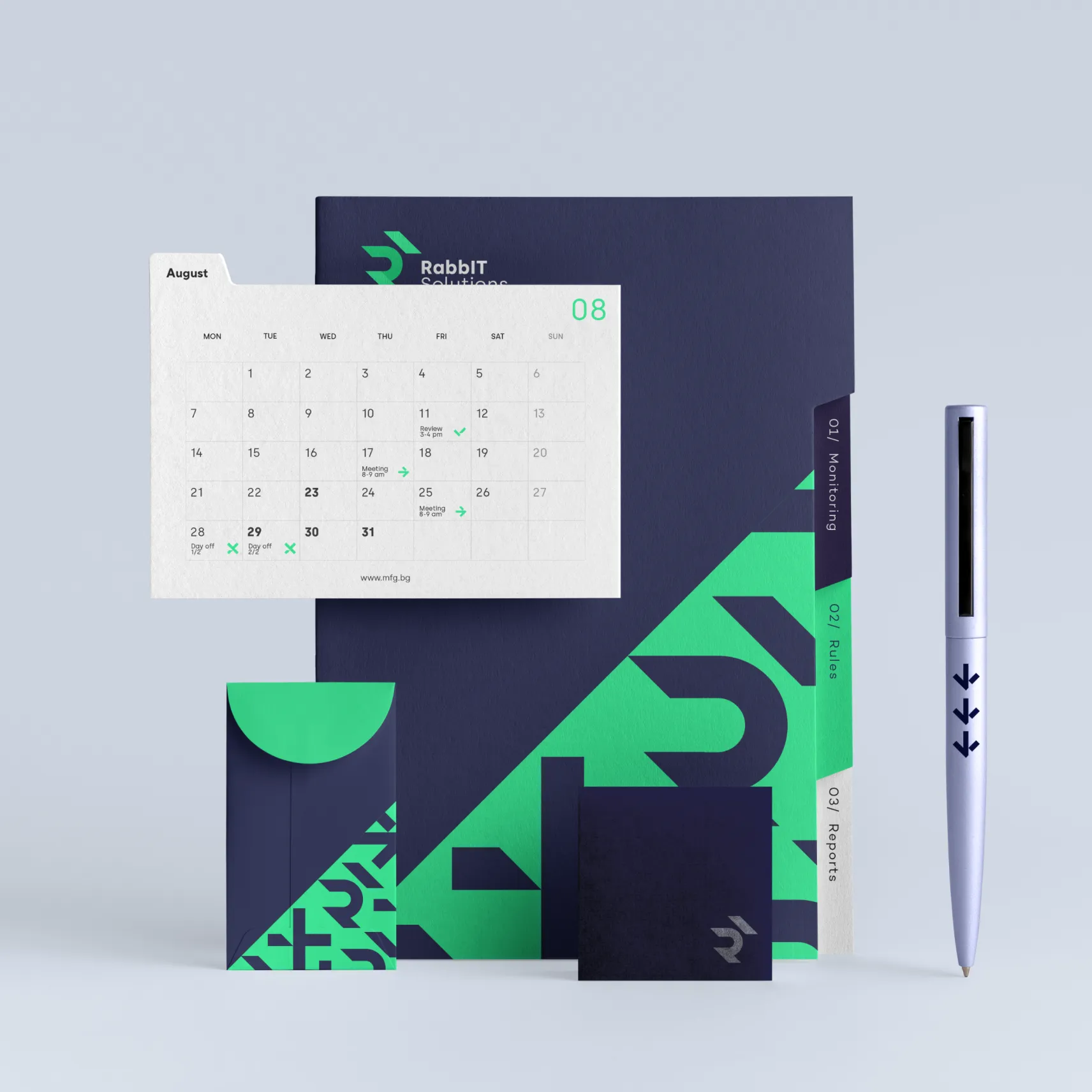
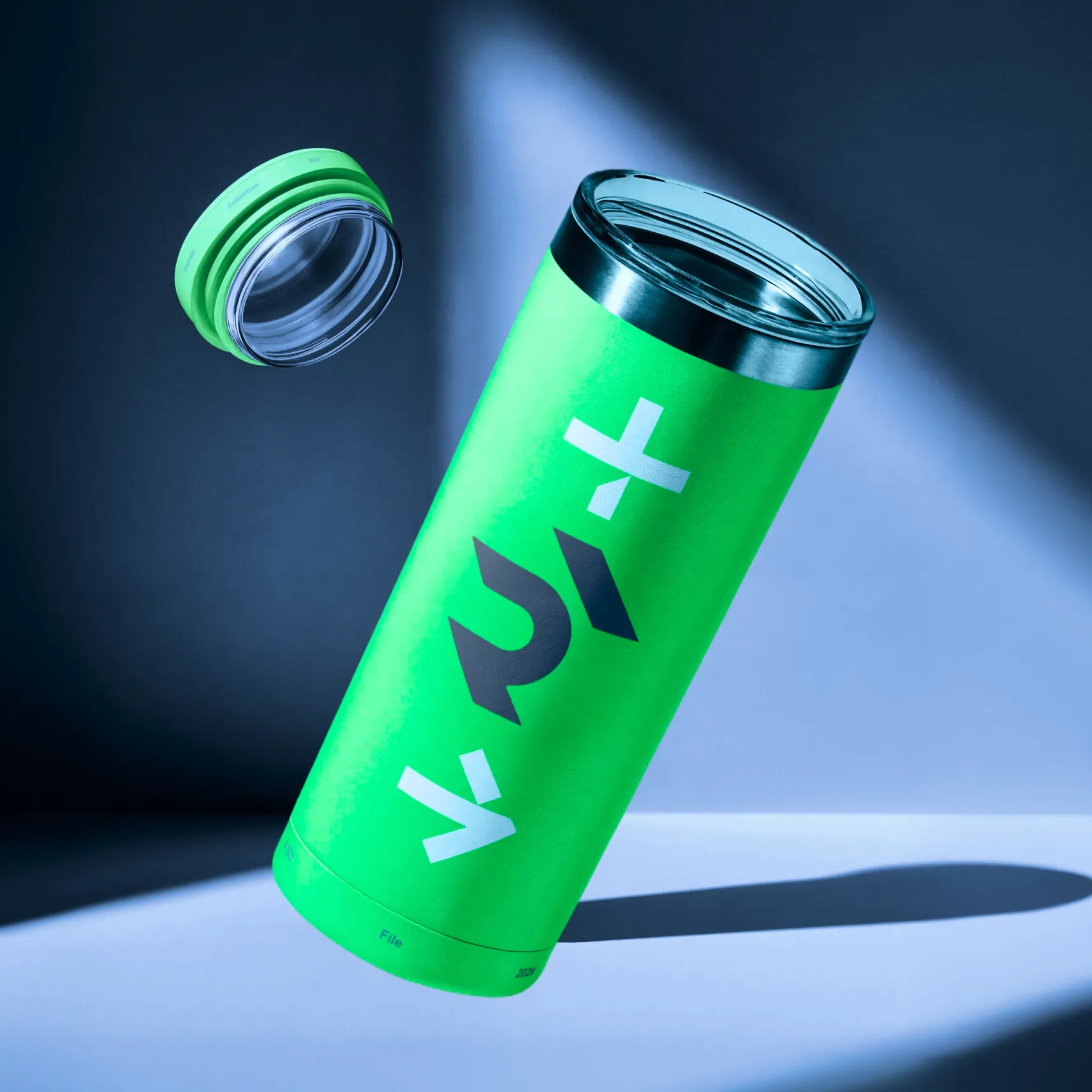
The angled shapes of the logo grew into a full visual language. Simplified, they form a custom icon set (Action, More, Decline, Folder, Safe, Complete) that mirrors the key steps of a compliance workflow. Cropped and repeated, they create bold patterns for print, digital and merchandise. Art direction built on green light, movement and texture gives the brand a modern, tech-forward feel. Business cards, calendars and stationery carry the same confident navy-and-green contrast.
Visible Everywhere
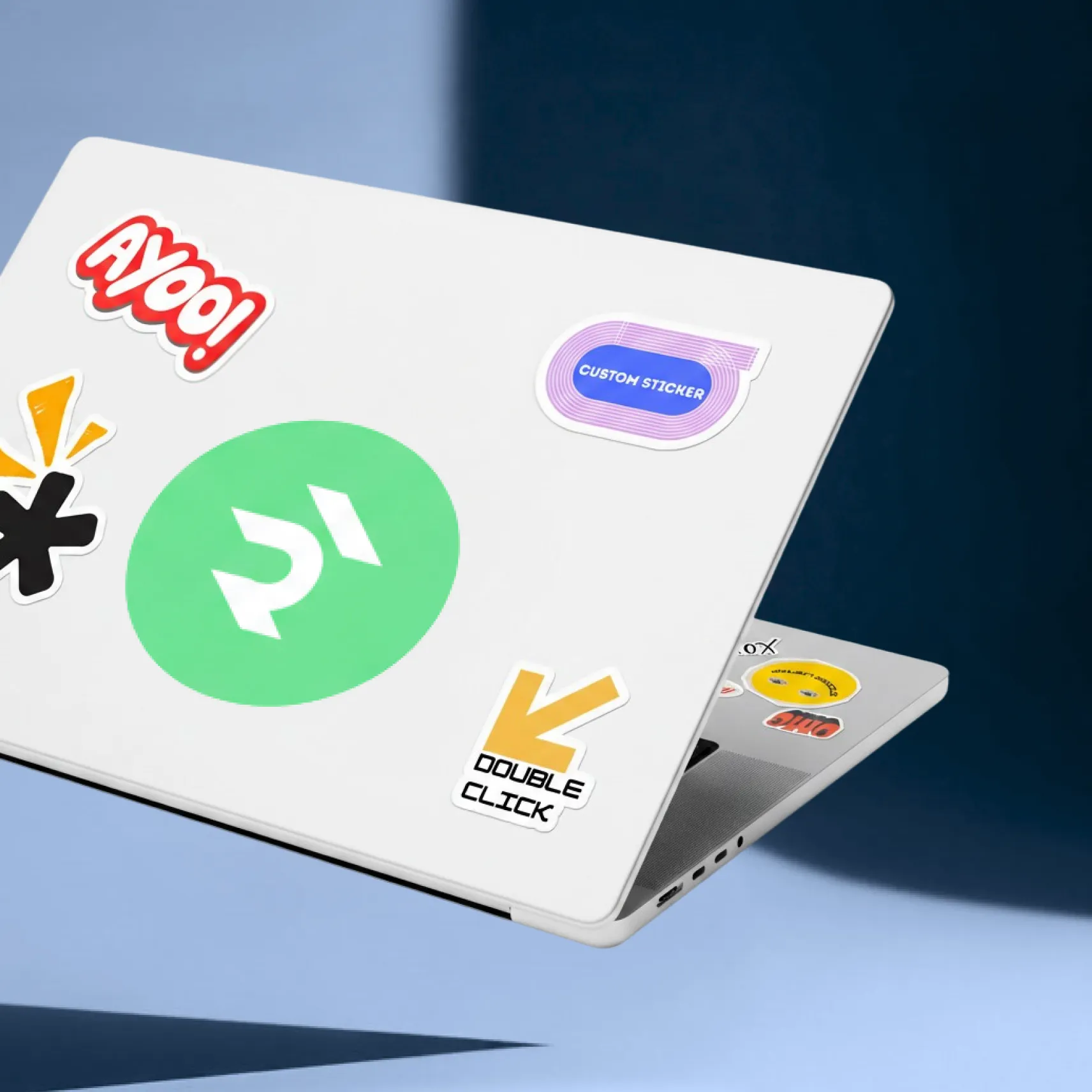
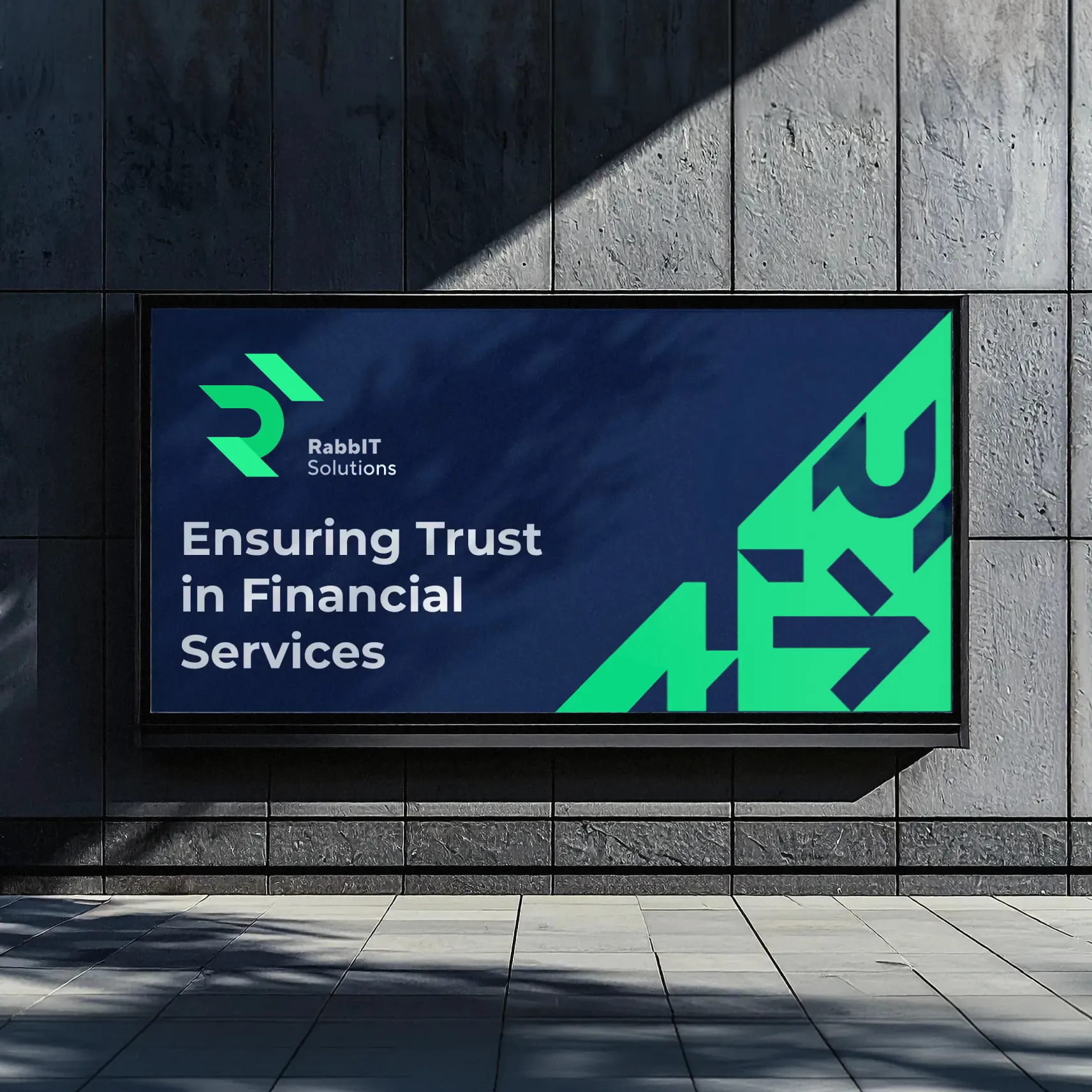
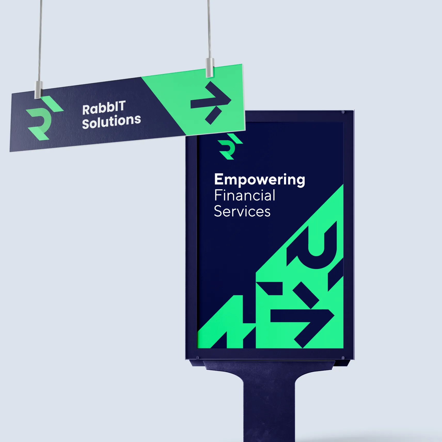
From packaging and stickers to large-format outdoor and in-office signage, the identity stays instantly recognisable at any scale. Clear messages like “Ensuring Trust in Financial Services” and “Empowering Financial Services” sit on strong navy backgrounds, while the green pattern draws the eye and adds energy.
Brand in Everyday Life
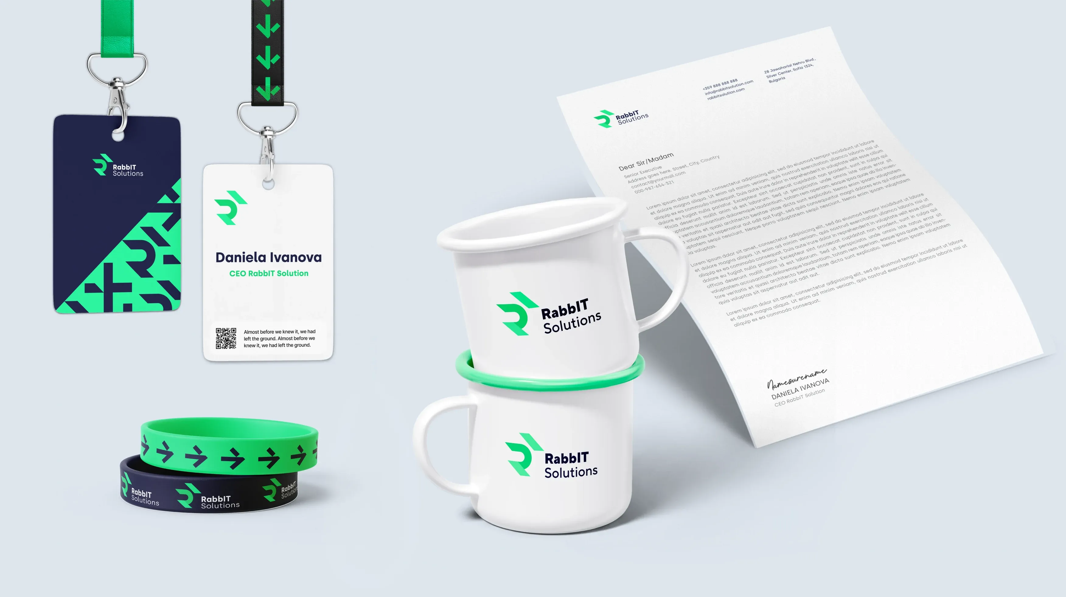
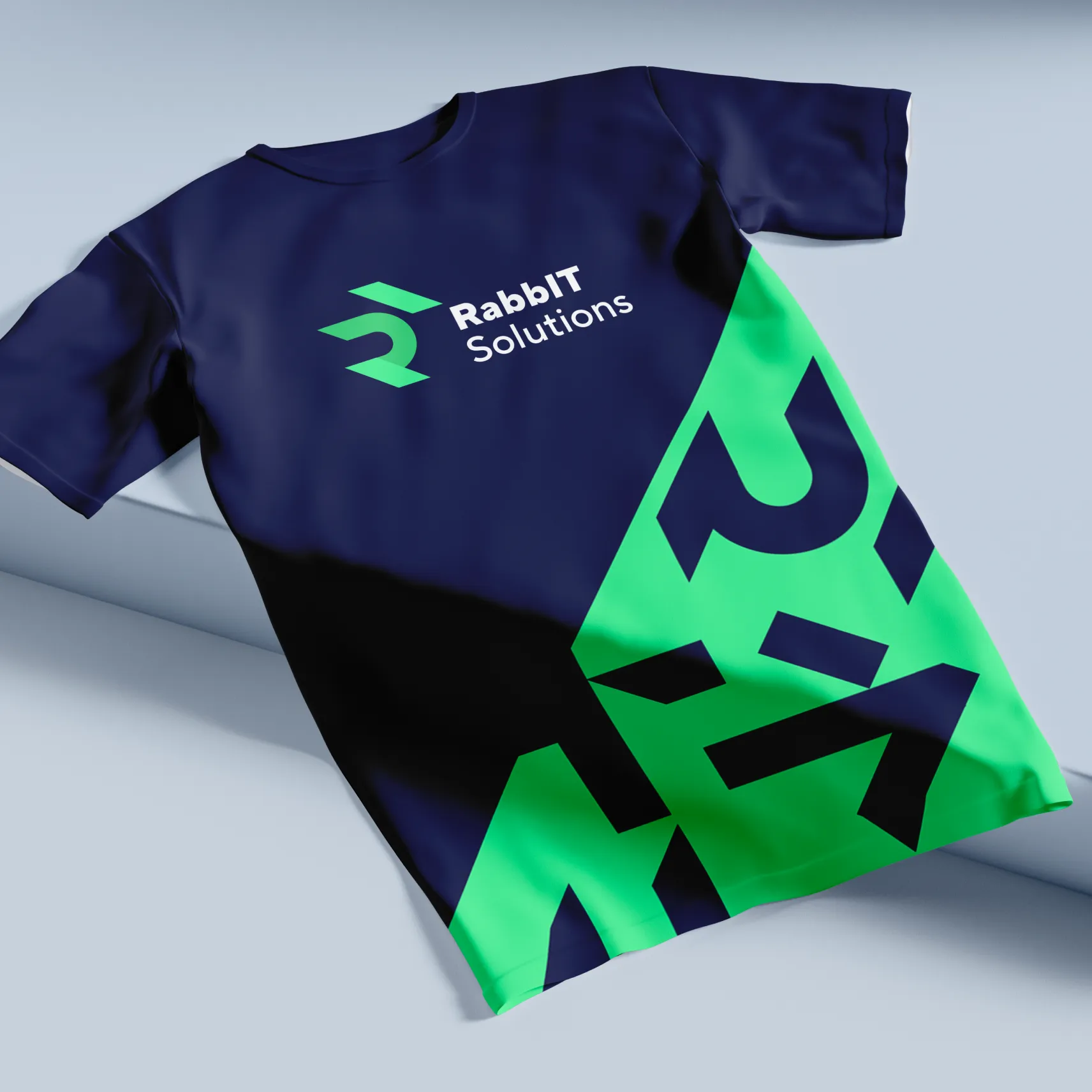
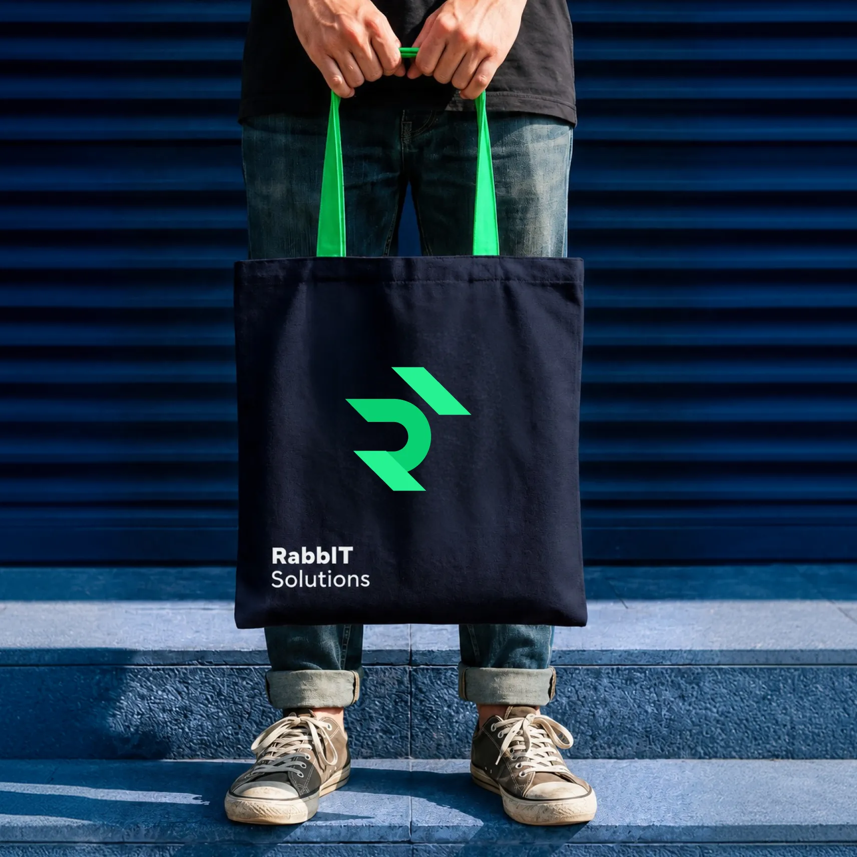
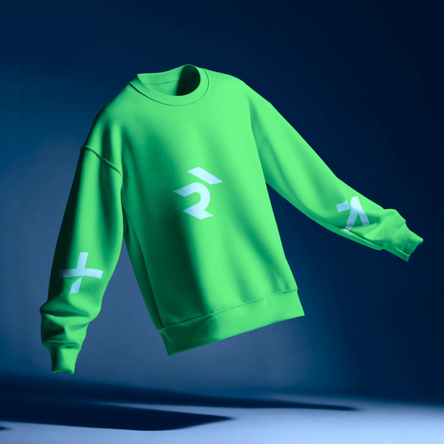
The brand extends naturally into the team’s daily life and events. ID badges and lanyards, wristbands, enamel mugs, letterheads, T-shirts, tote bags and sweatshirts turn the identity into something people wear and use. This helps build a strong sense of belonging inside the company and visibility outside it.
Final Impact
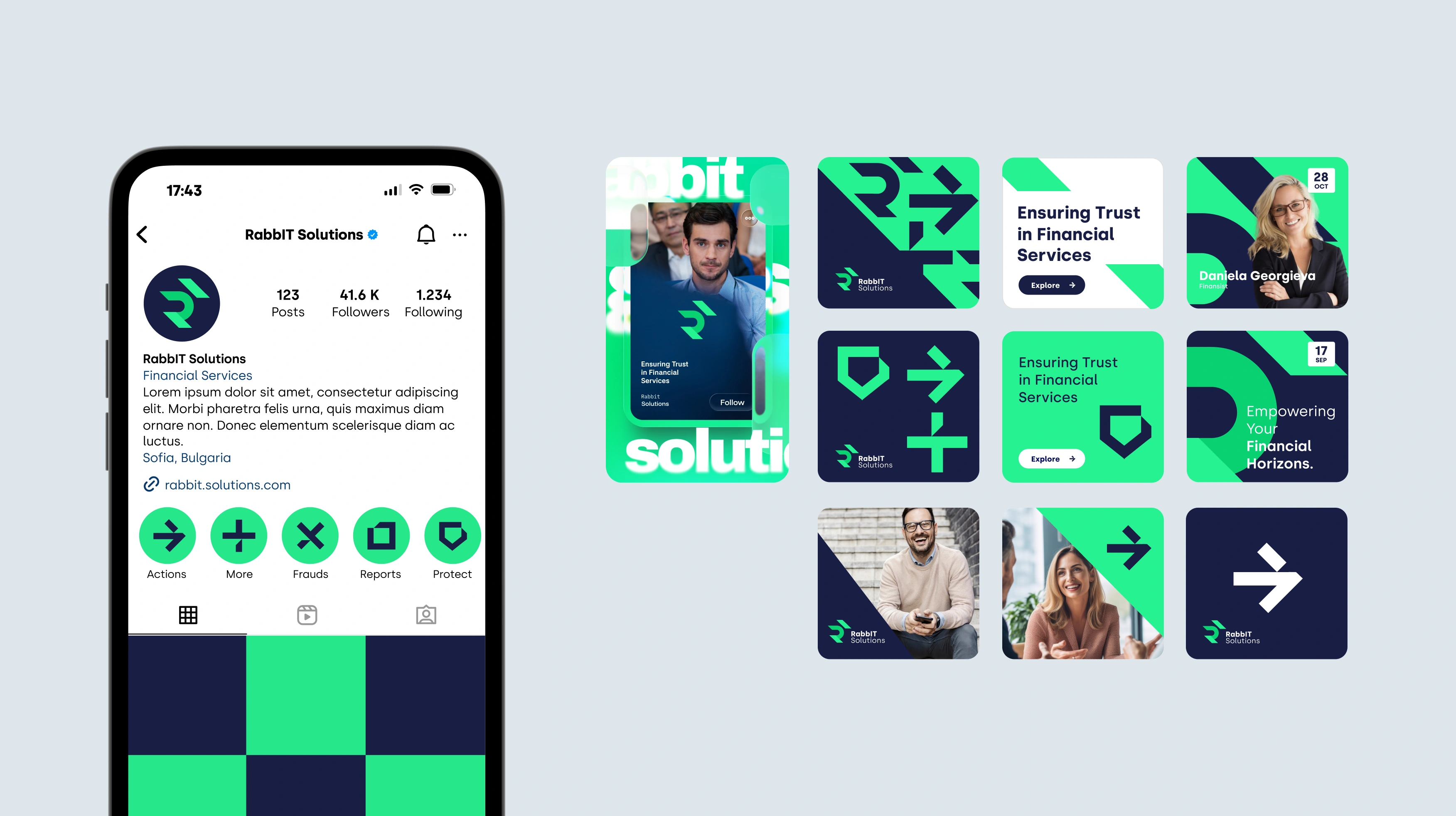
On social media, a set of flexible templates combines the pattern, the icon set and real people, keeping every post on-brand while leaving room for variety.
RabbIT Solutions now has an identity that matches the ambition of its product: modern, precise and built to scale. It stands out in a conservative industry, communicates trust and speed at a glance, and gives the team a clear system to grow with.