

The Project
Bringing complex workflows into focus
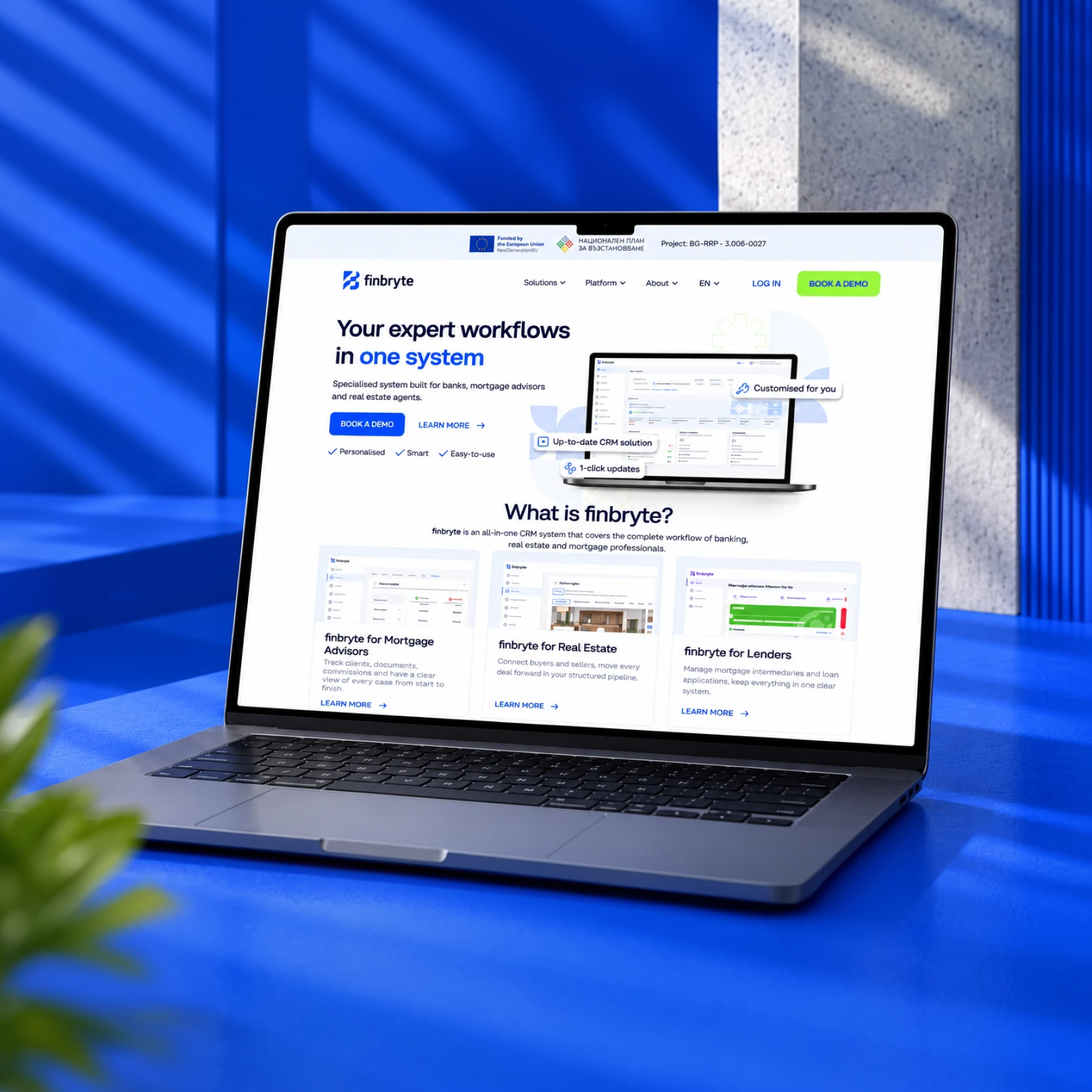
Finbryte is an all-in-one CRM designed around the workflows of banking, mortgage and real estate professionals. The platform brings client information, documents, cases, property listings and commissions into a more structured working environment.
Our work combined brand identity development with UX/UI design for key platform workflows, creating a consistent visual language that connects the brand with the digital product.
Visual Identity
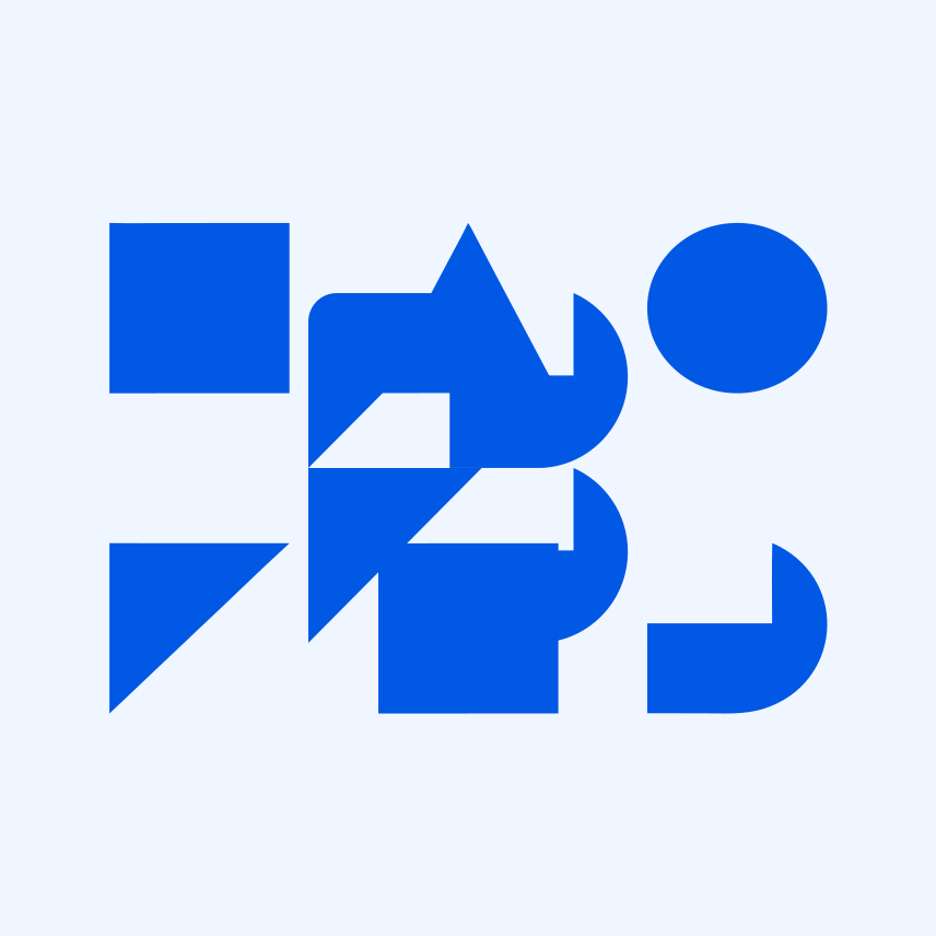
A distinctive identity, built on geometry
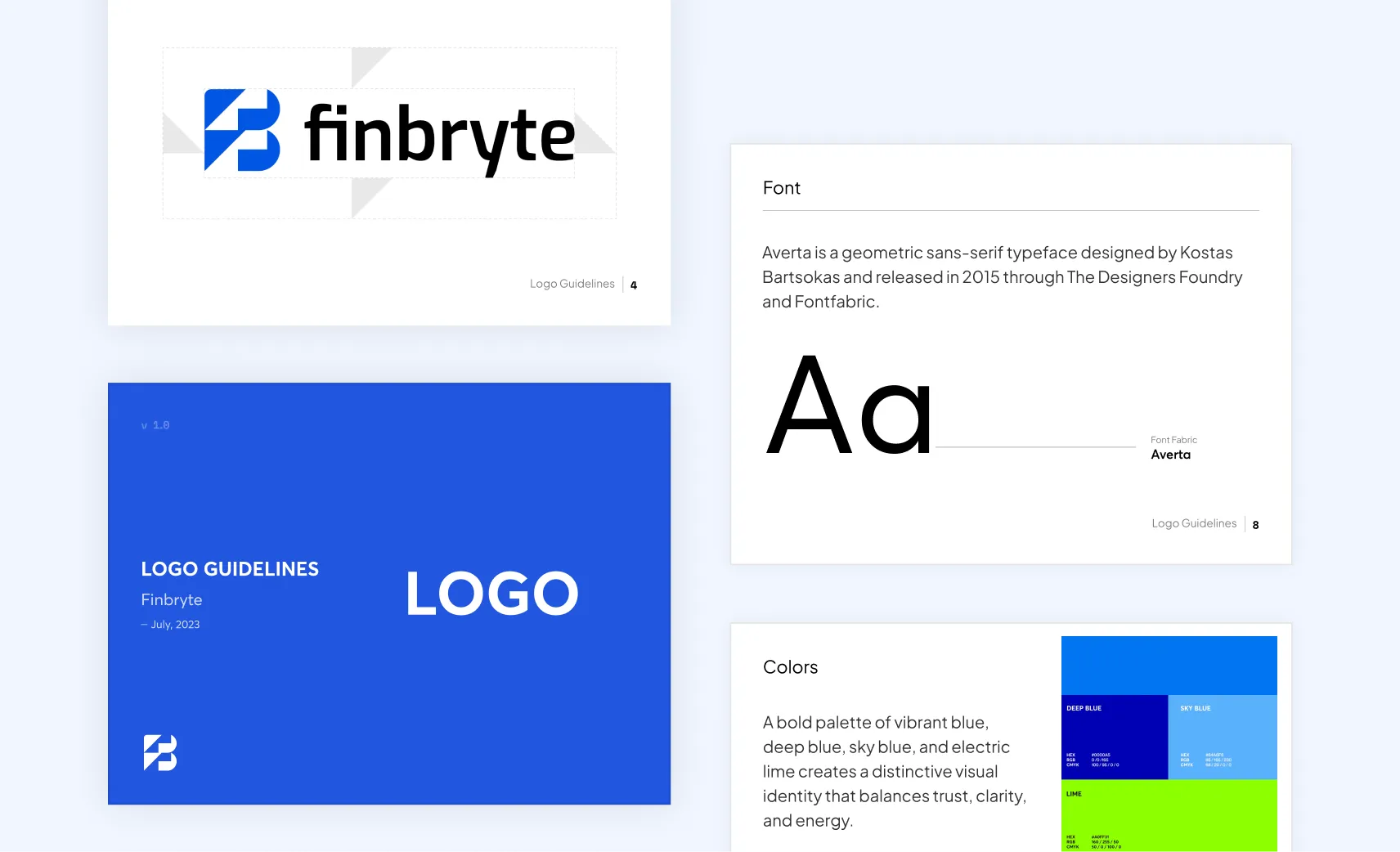
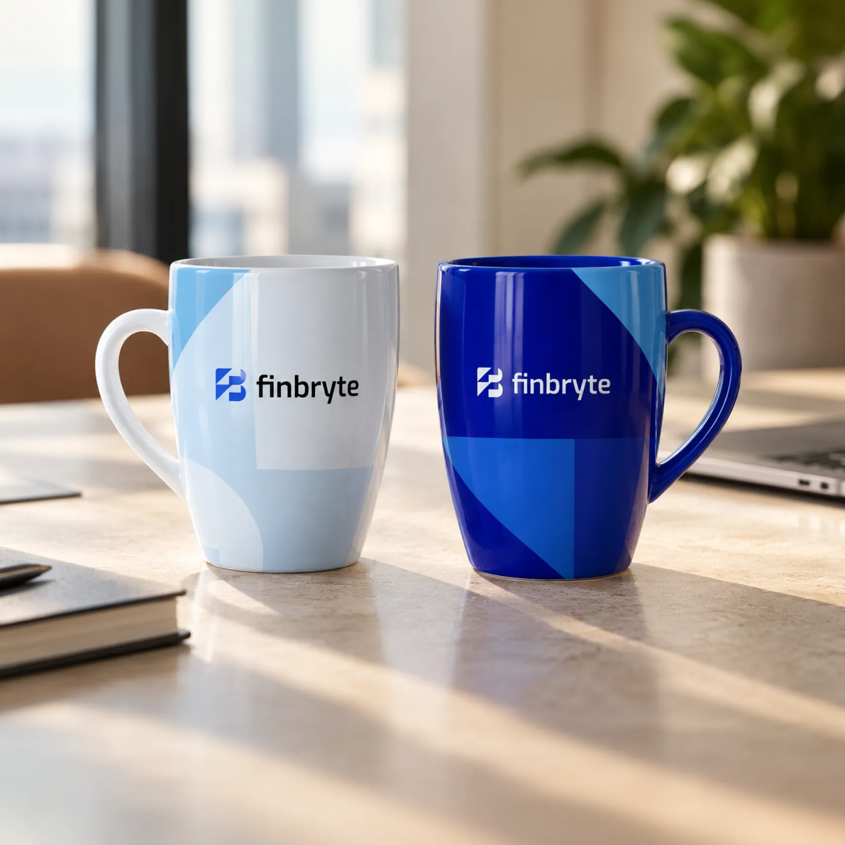
At the heart of the Finbryte identity is a geometric symbol that brings together the brand’s two initials, F and B. Abstract shapes and carefully crafted negative space reveal the letter F within the bold form of the B, creating a distinctive mark that reflects the name itself.
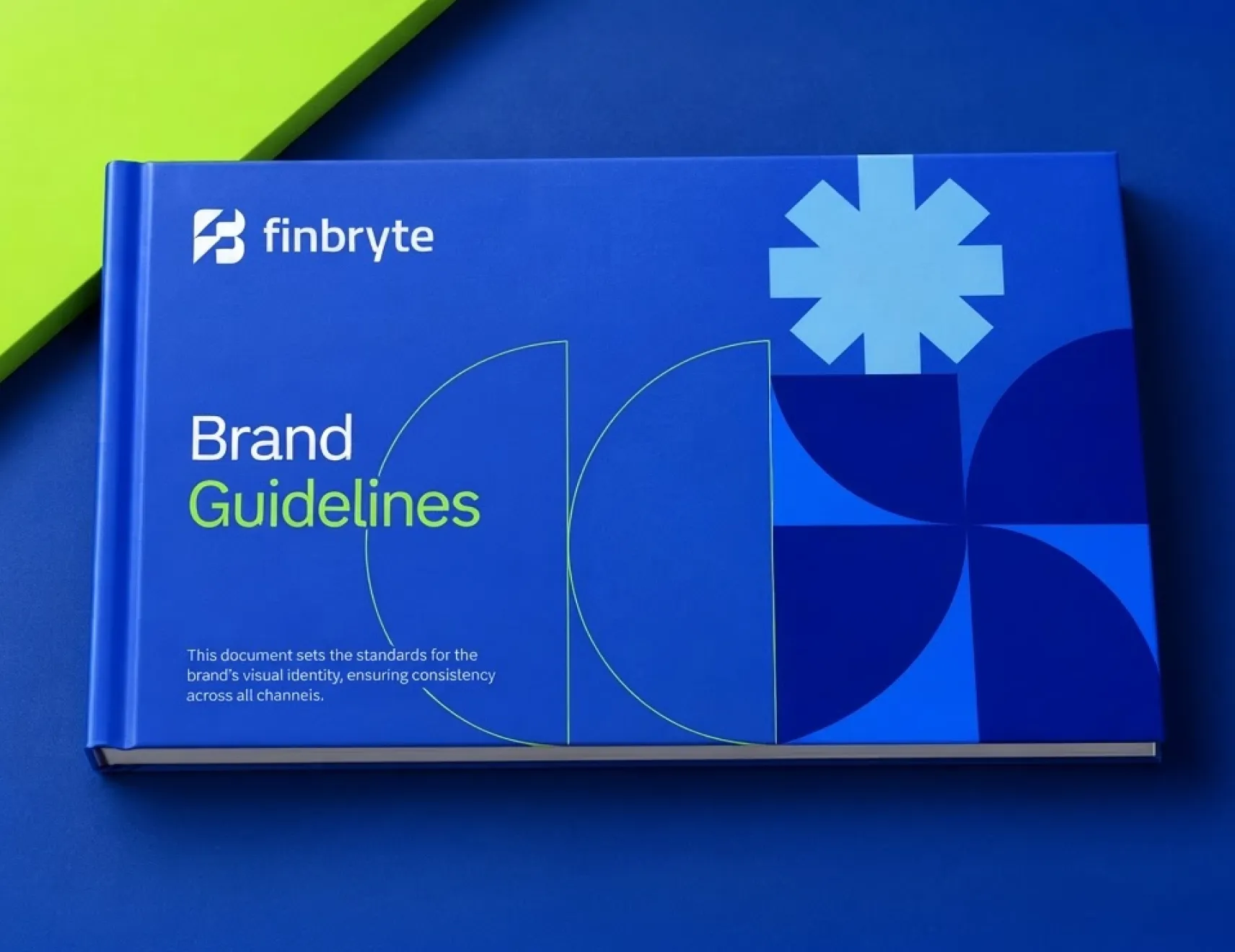
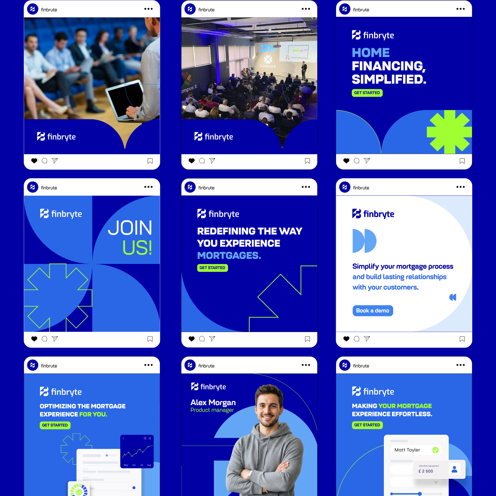
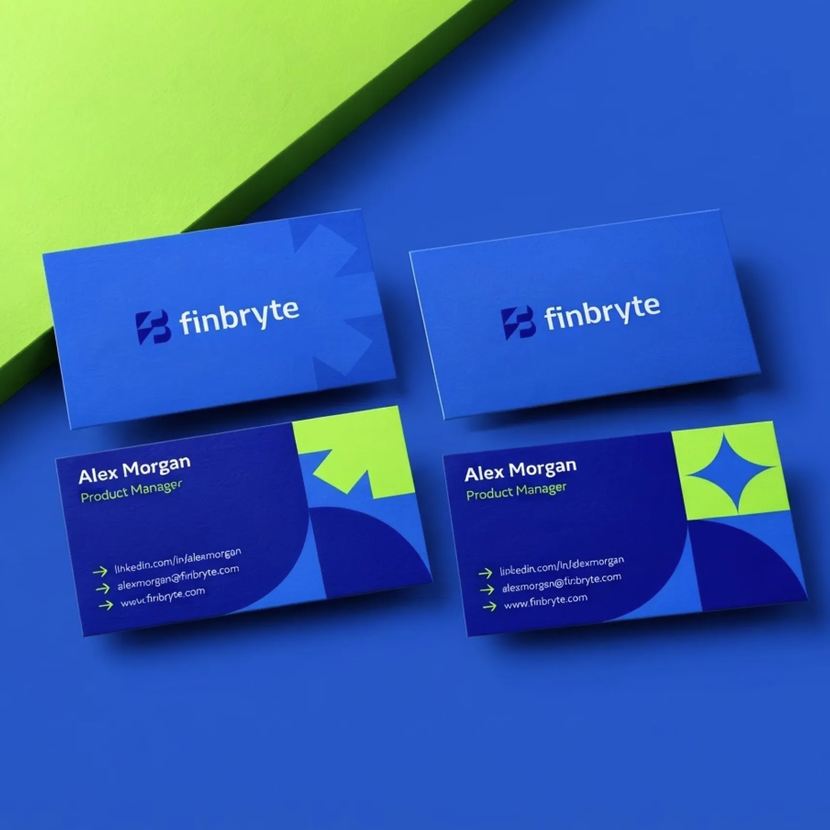
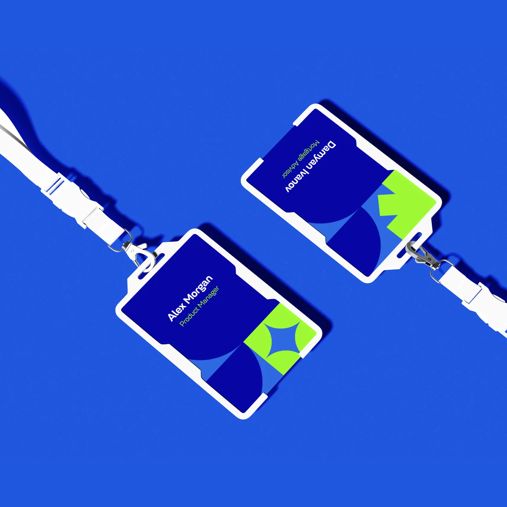
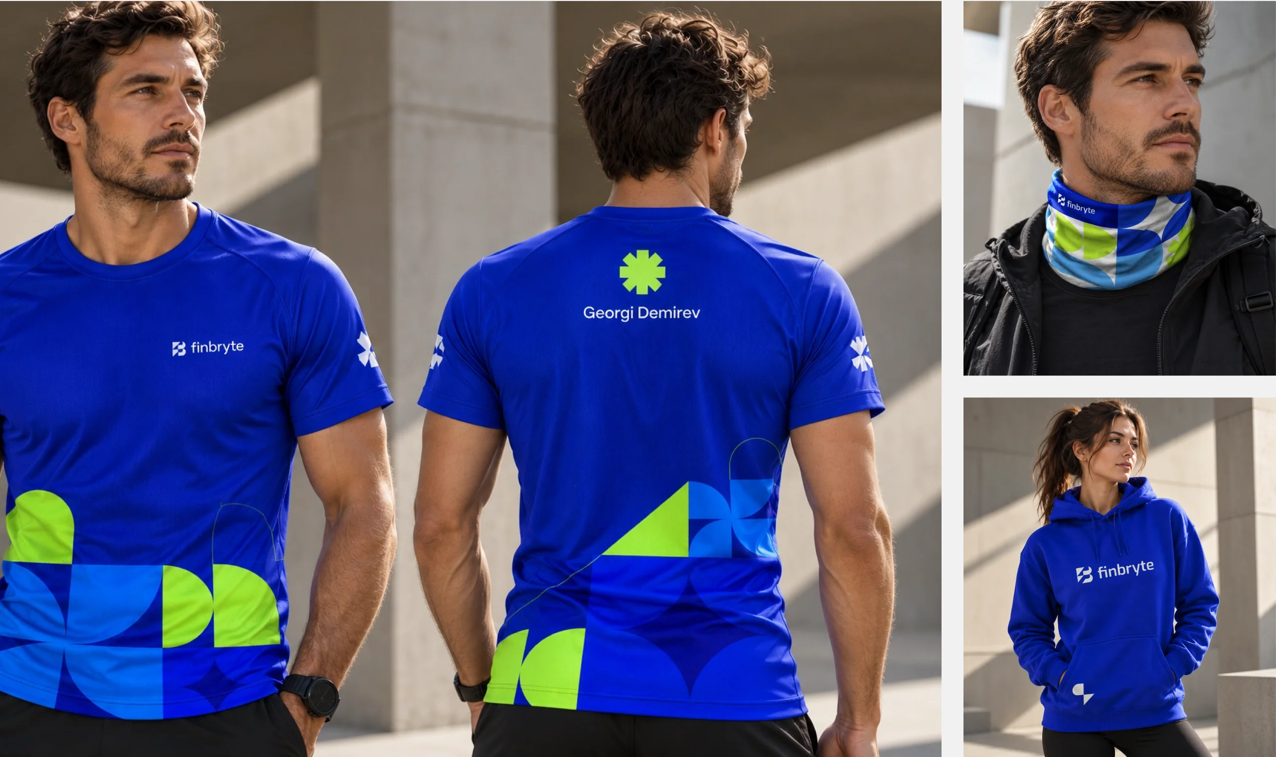
This geometric foundation extends across the entire visual identity. A considered palette of blues and electric lime, expressive typography and a modular graphic system work together to create a bold, contemporary visual language. The brand guidelines bring these elements into a cohesive system, defining logo usage, colour, typography, graphic elements and layout principles.
UX/UI
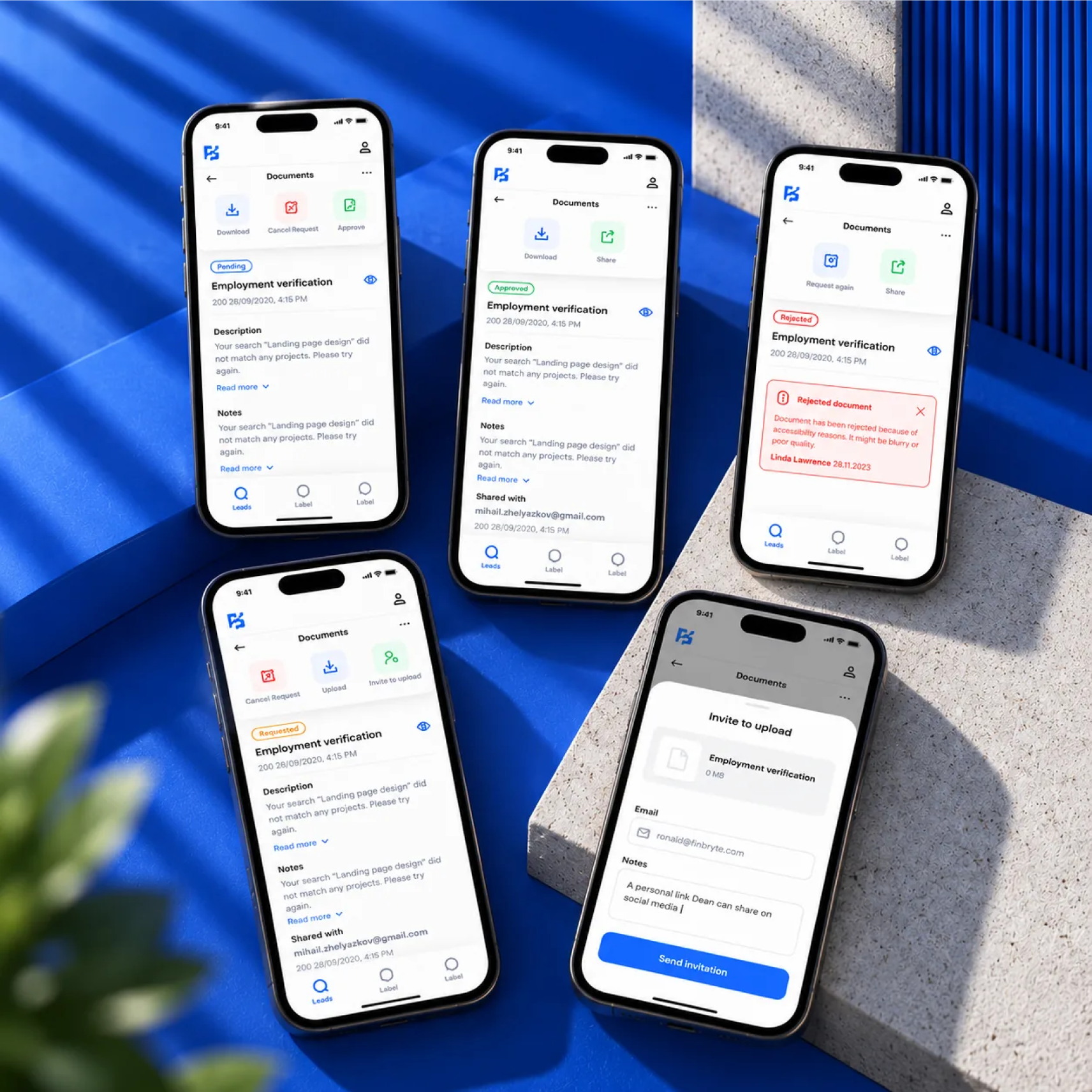
For the Finbryte app, we designed a clear, guided experience for requesting, uploading and reviewing verification documents. Every document follows one consistent screen pattern with colour-coded statuses (Requested, Pending, Approved, Rejected), and the available actions change with each state, so users always know where things stand and what to do next. Rejected documents explain why and offer a one-tap way to request again. A simple “invite to upload” flow lets users bring others into the process by email. The result is a calm, trustworthy interface that makes a bureaucratic process feel simple and transparent.
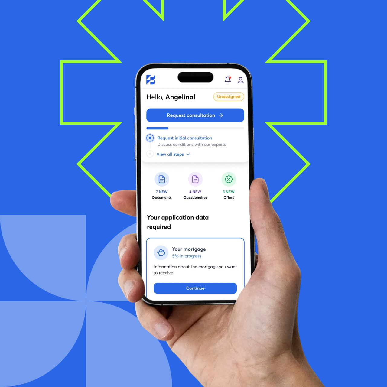
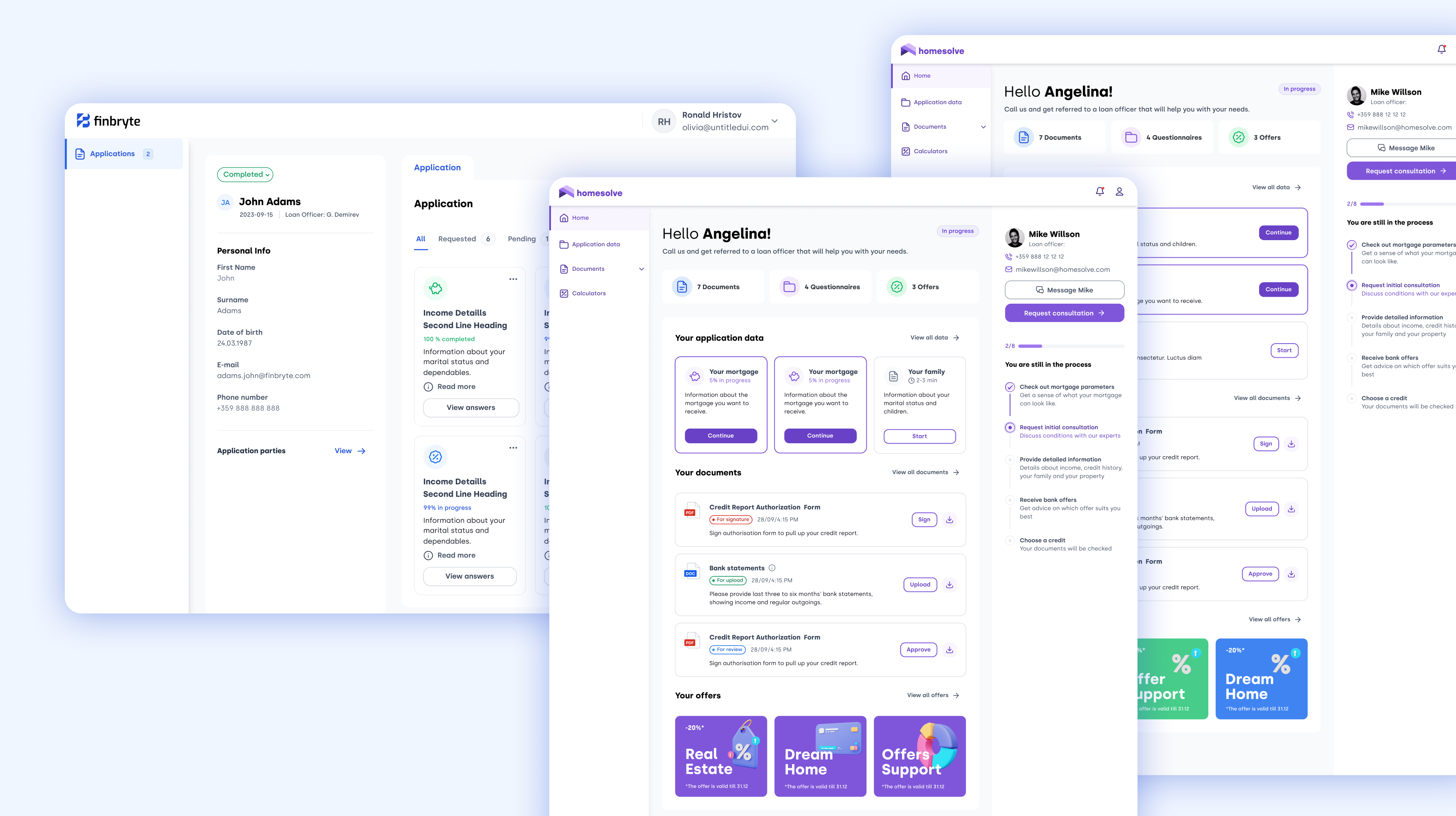
From brand to product, one consistent experience. Finbryte’s users work with large amounts of data every day: clients, applications, documents and offers. We designed the mobile experience to make these workflows simple and clear. Each step shows what is required, how long it takes and what comes next, so users always know where they are in the process.
The interface carries the brand’s geometric language into the product. Rounded cards, a clear hierarchy and the signature blue keep complex financial journeys calm and easy to follow.
- Guided application flows with clear progress and time estimates
- A dashboard overview of documents, questionnaires and offers
- A UI system built on the same geometry and colours as the brand
Team:
Creative Direction: Angelina Tomova
Naming & Brand strategy: Mihail Zhelyazkov
UX/UI: Marina Hristova | Angelina Tomova | Mihail Zhelyazkov
Animation: Marina Hristova | Monika Radeva