


Design Challenge
Stretchy’s furniture is made from paper that folds into a compact block and stretches open into stools, benches and seating that fit any room. The challenge was to create an identity as clever and flexible as the product itself, one that feels natural, warm and design-led rather than technical.
Logo Concept
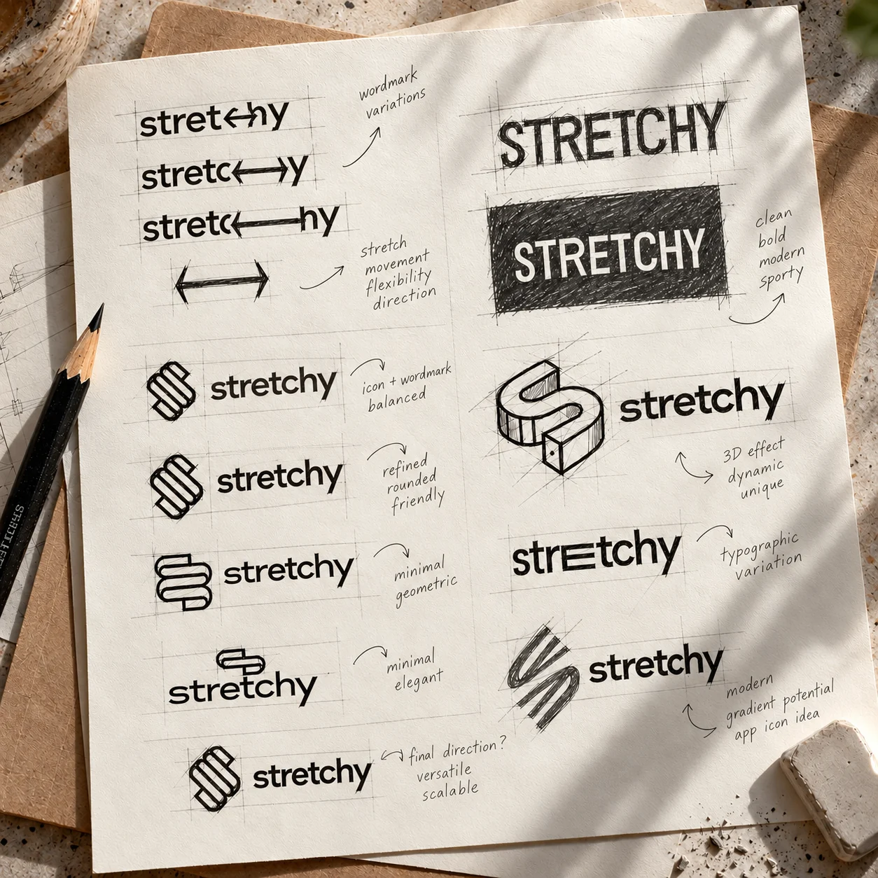
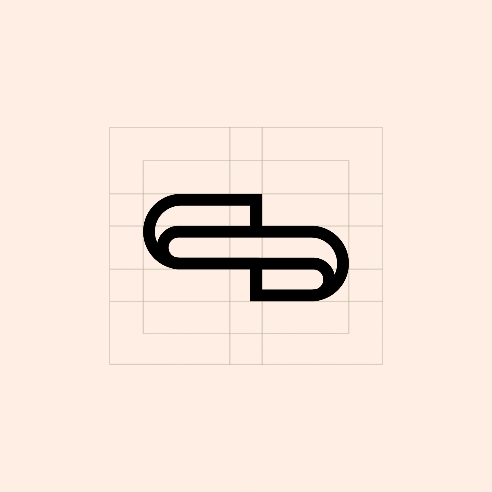
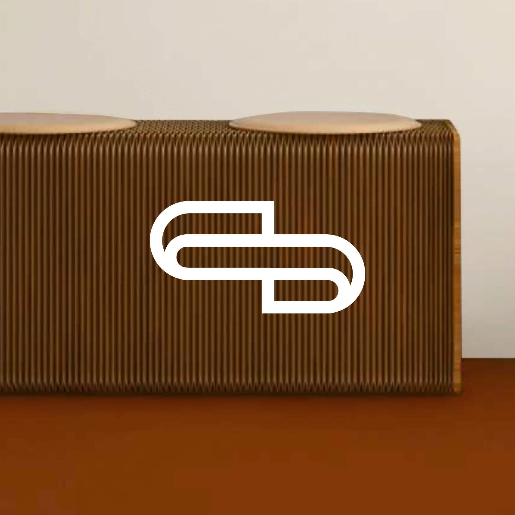
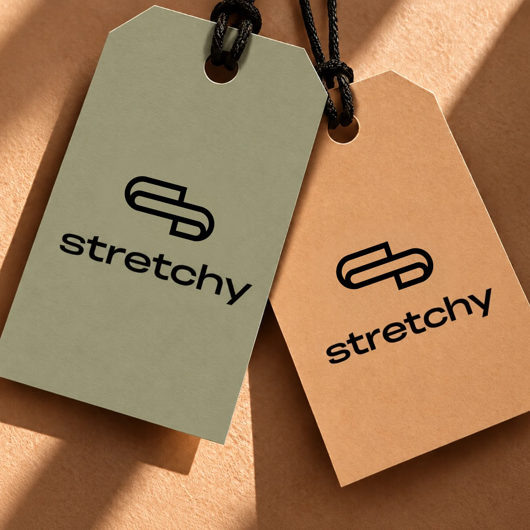
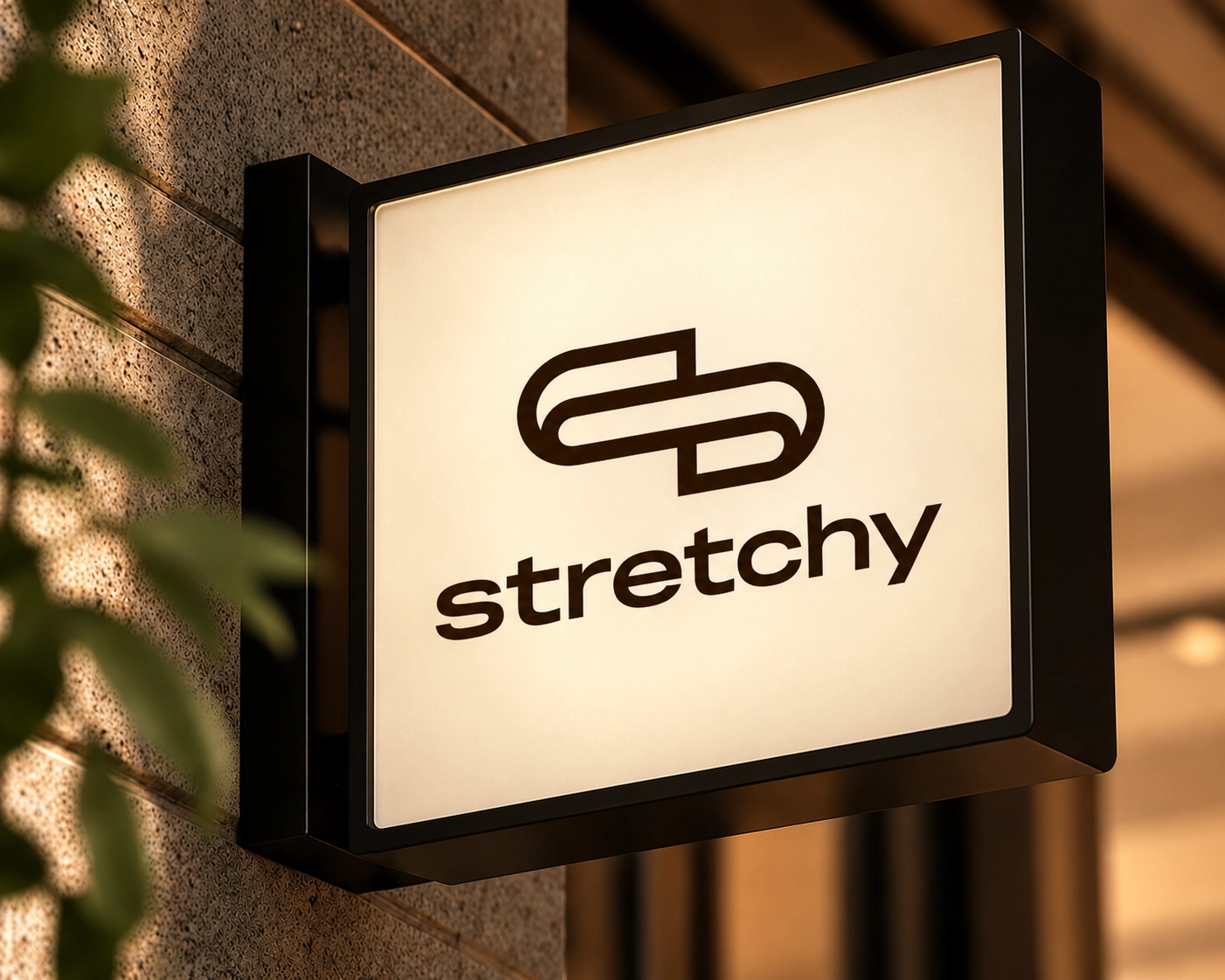
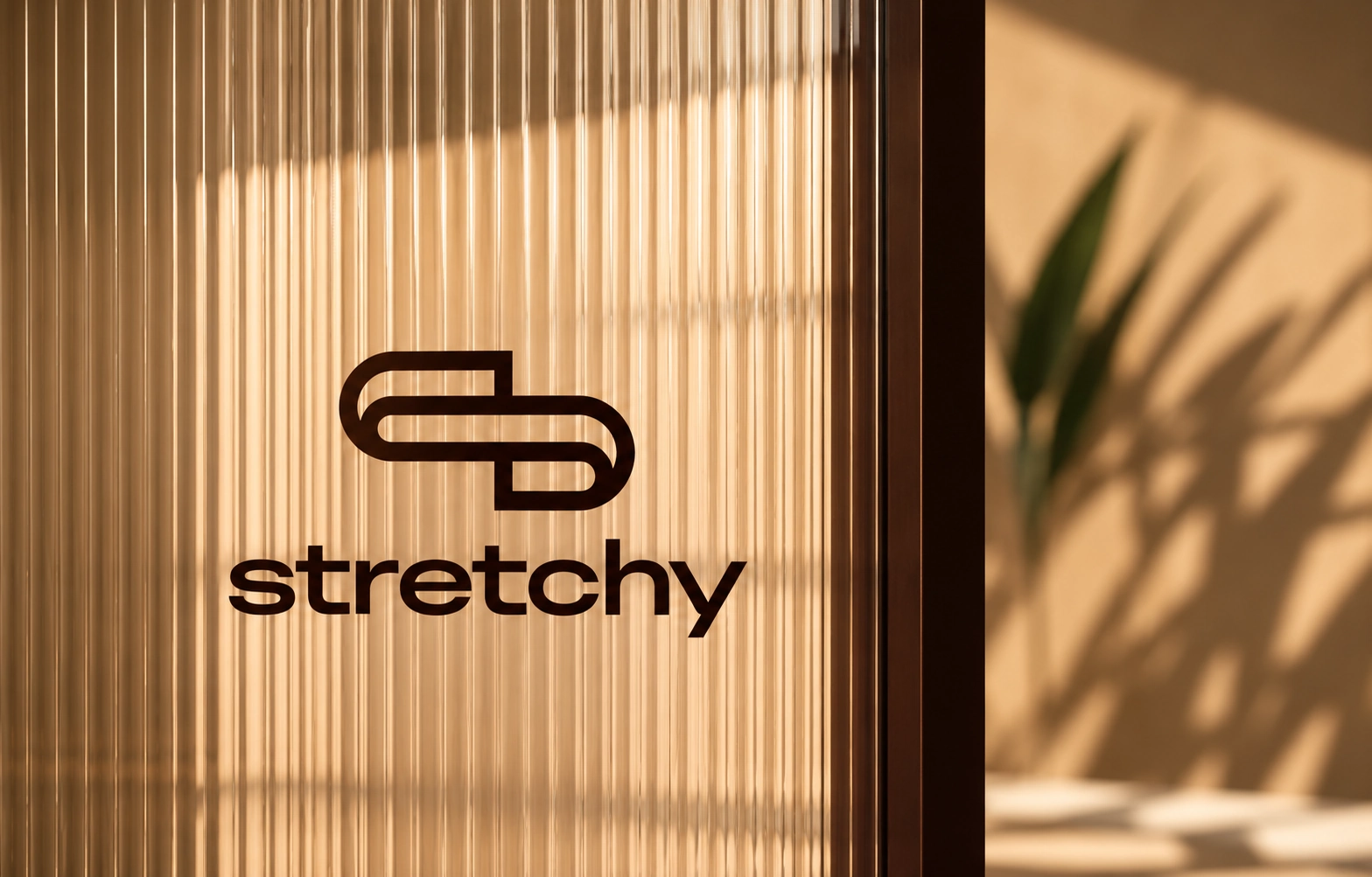
The logo is a single continuous line that folds back on itself to form an “S”, just like a sheet of paper stretched out and folded. It’s simple enough to work as an icon on a tag or a stamp, and expressive enough to carry the whole brand. We explored many directions in sketches before arriving at this mark, choosing it for its balance of movement, simplicity and versatility.
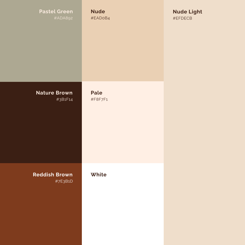
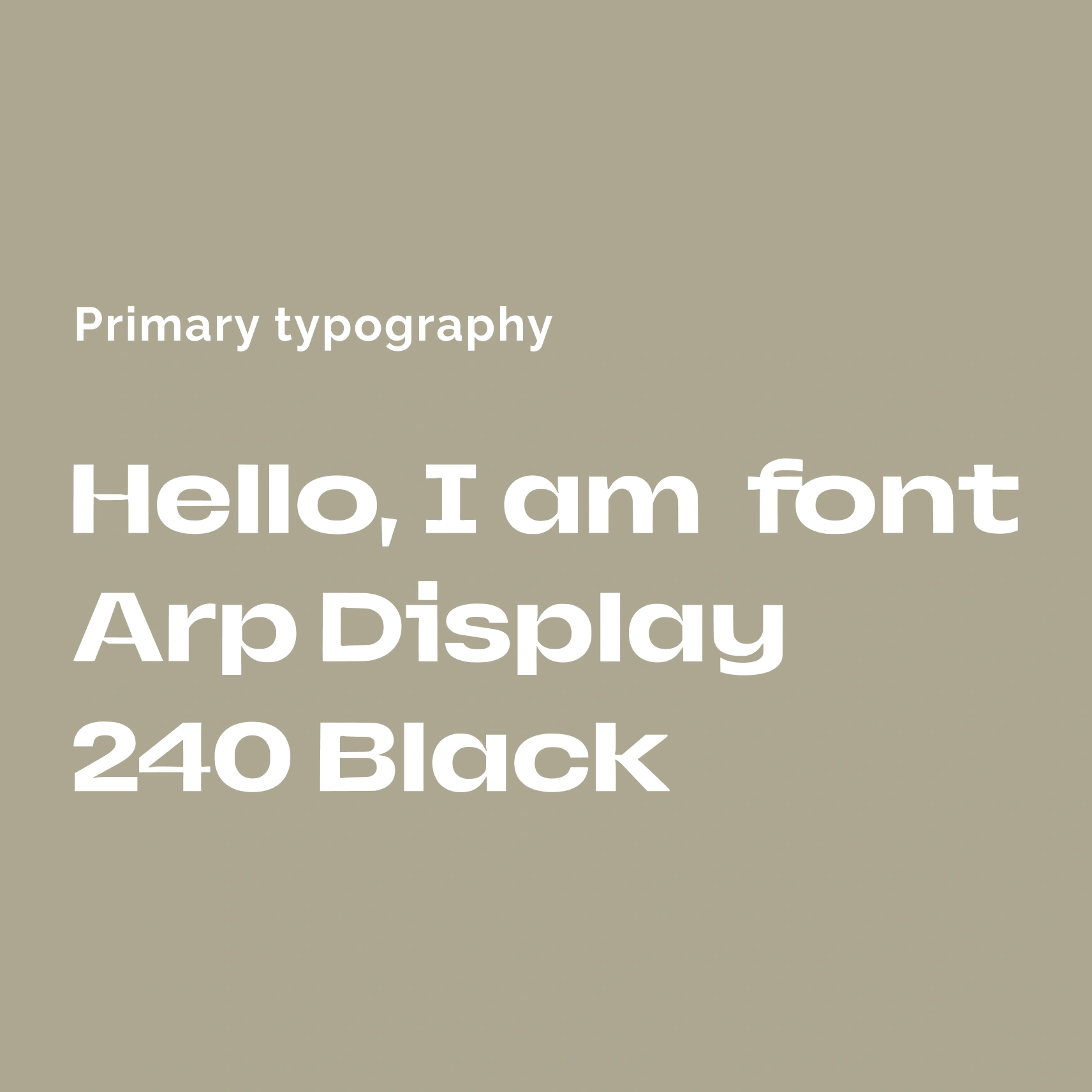
Colour & Typography
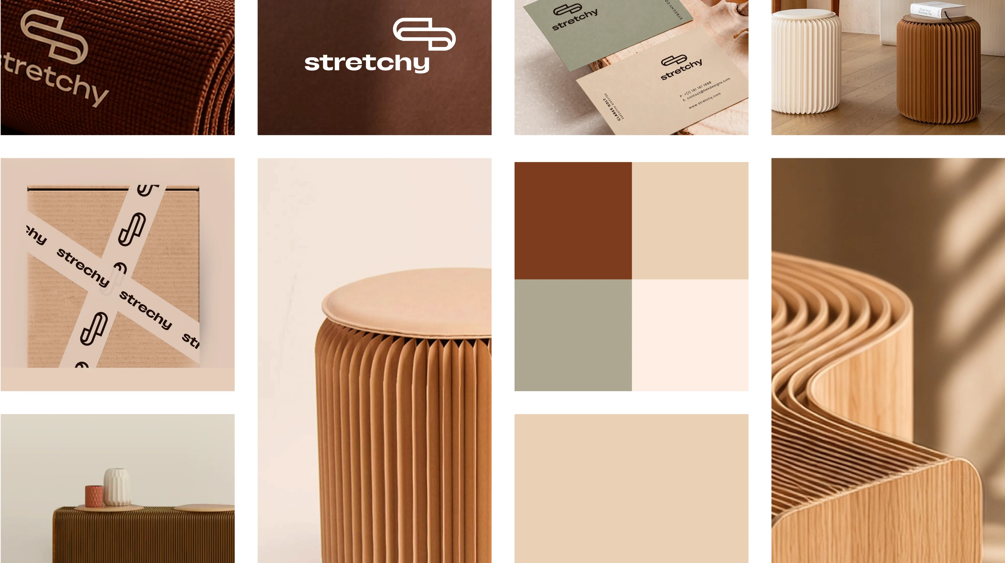
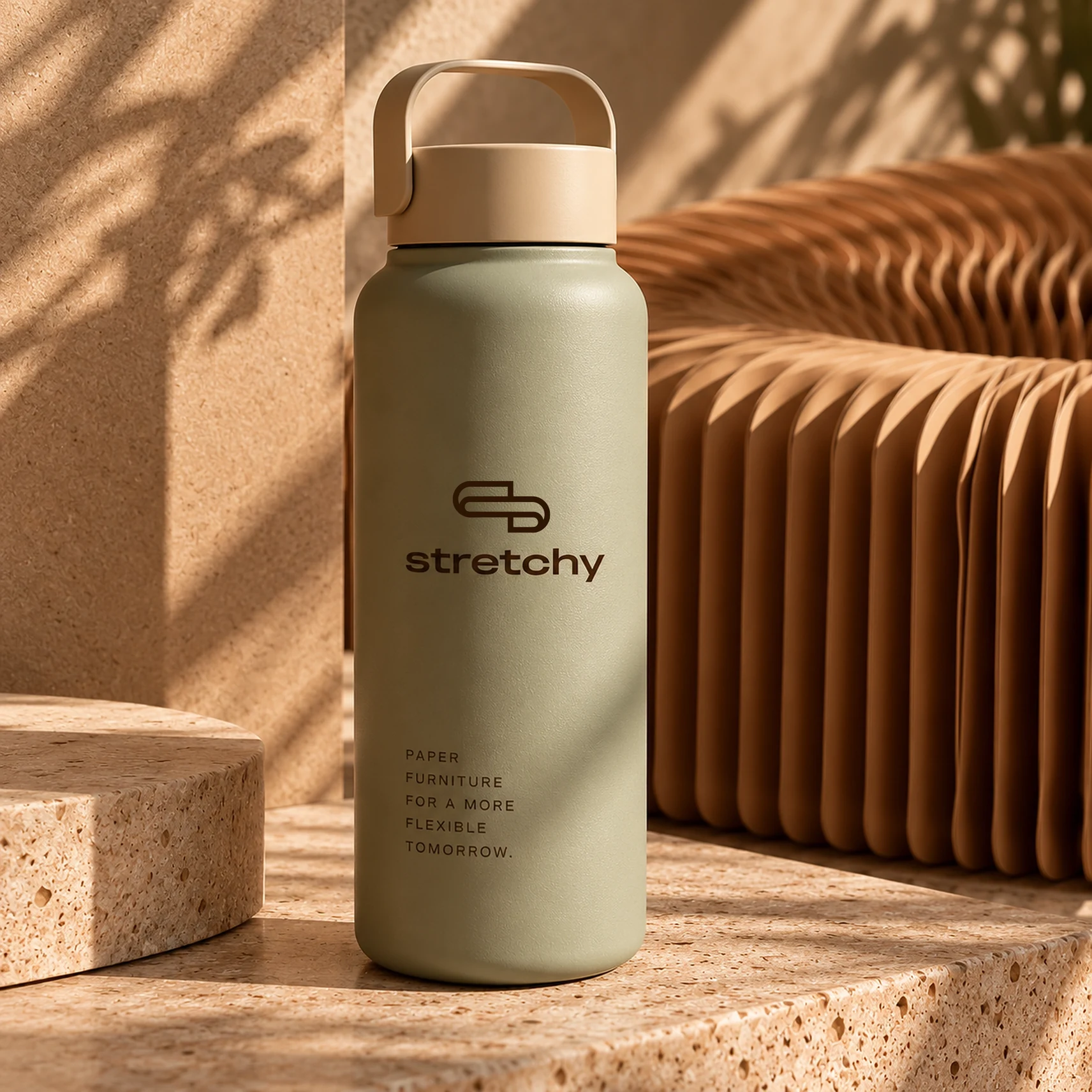
The colour palette comes straight from the material: kraft and nude tones, deep nature brown and a soft pastel green that adds a calm, sustainable note. A bold, rounded display typeface keeps the wordmark friendly and confident. Together they create a warm, earthy system that feels as tactile as the furniture.
- Logo design and brand identity
- Colour palette and typography
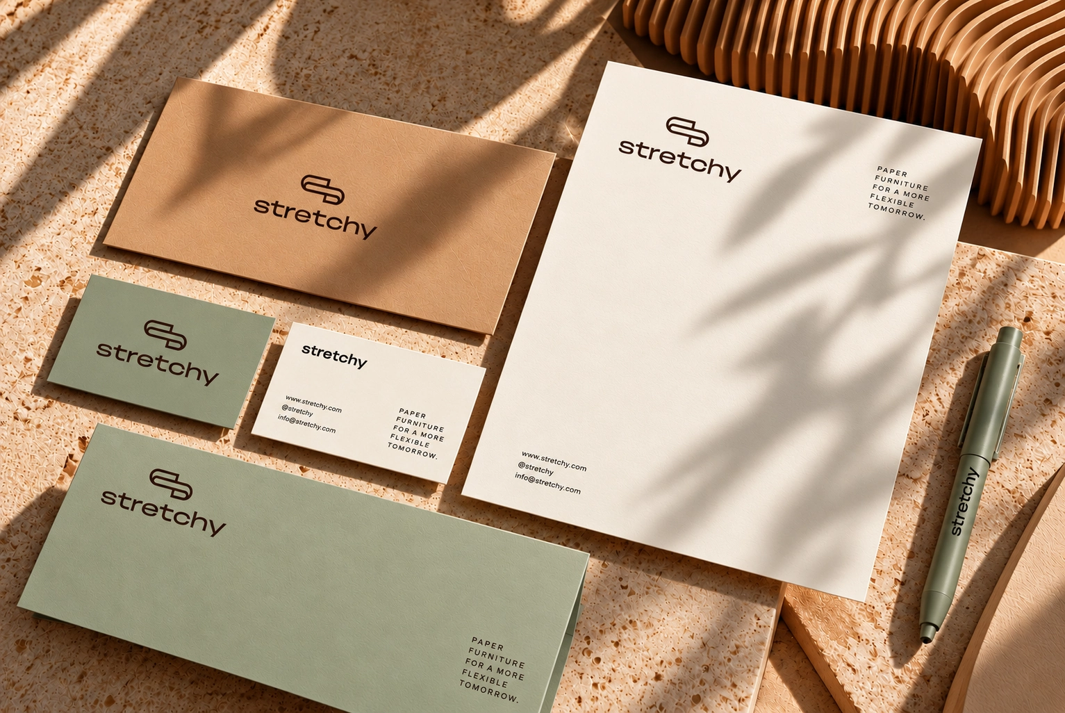
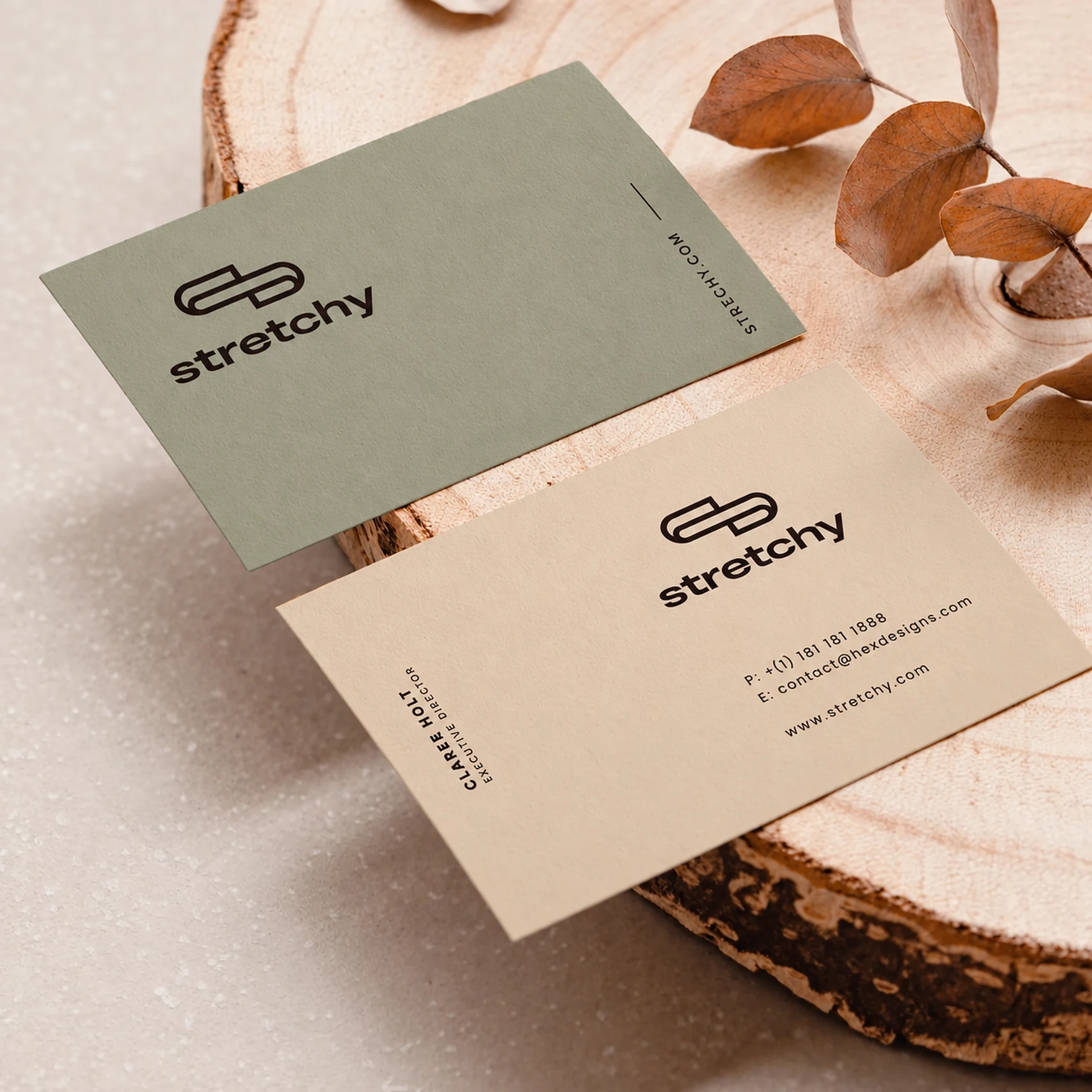
- Stationery, business cards and hang tags
- Packaging tape, tote bags and merchandise
- Flyers and in-store signage
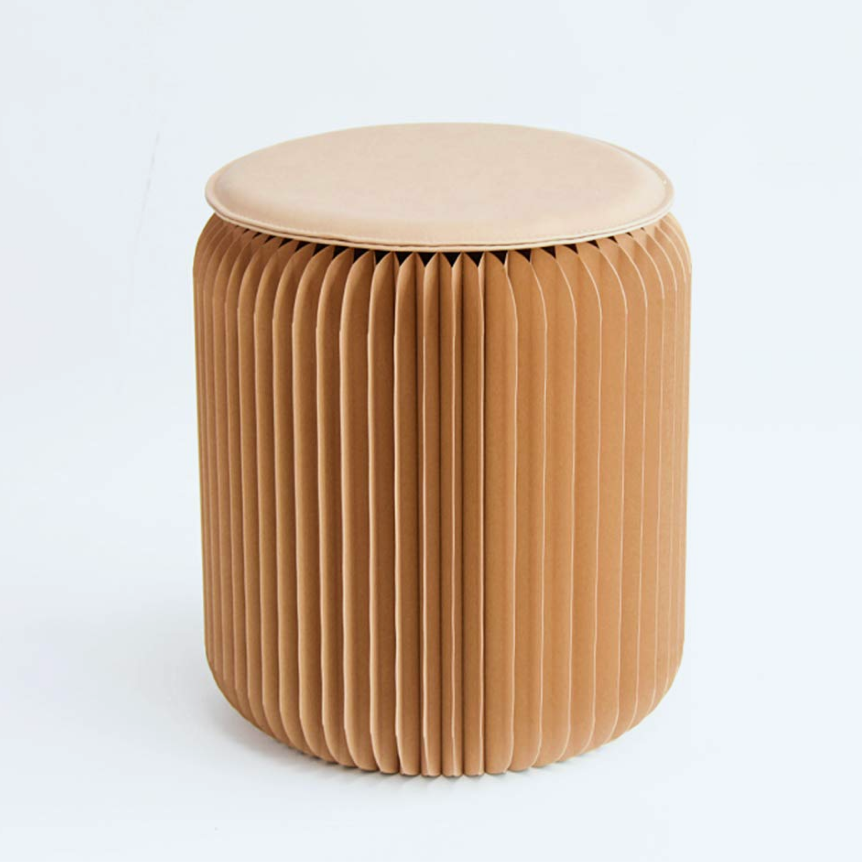
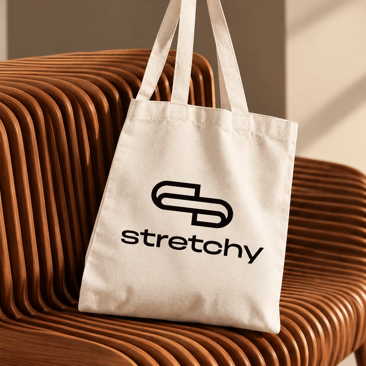
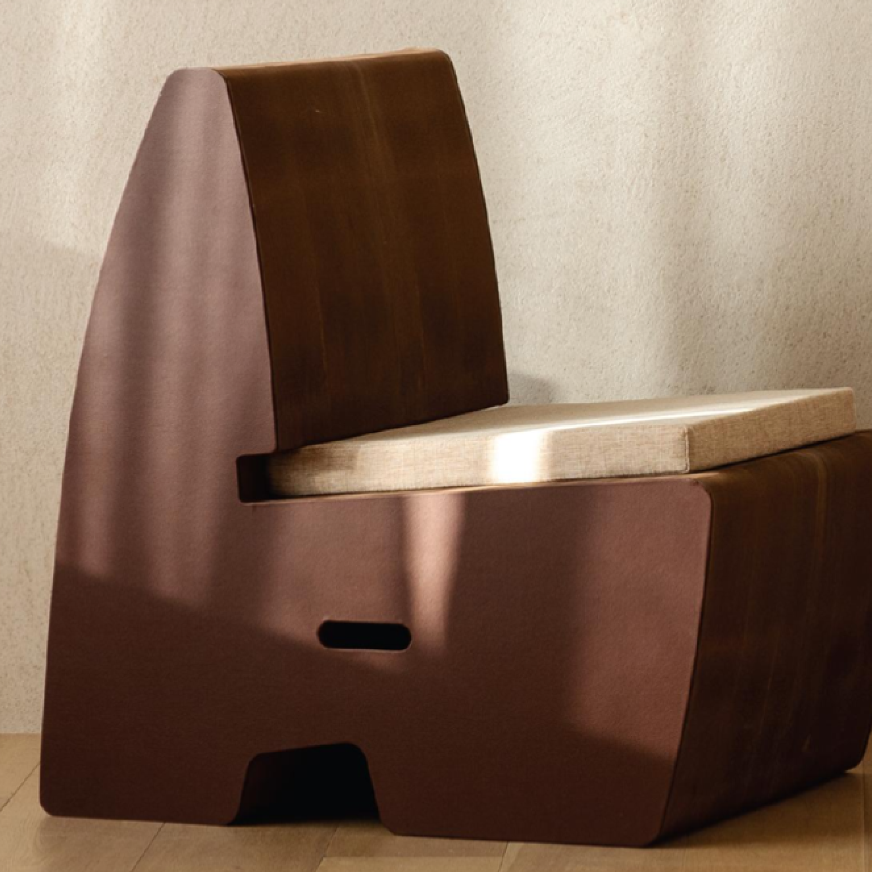
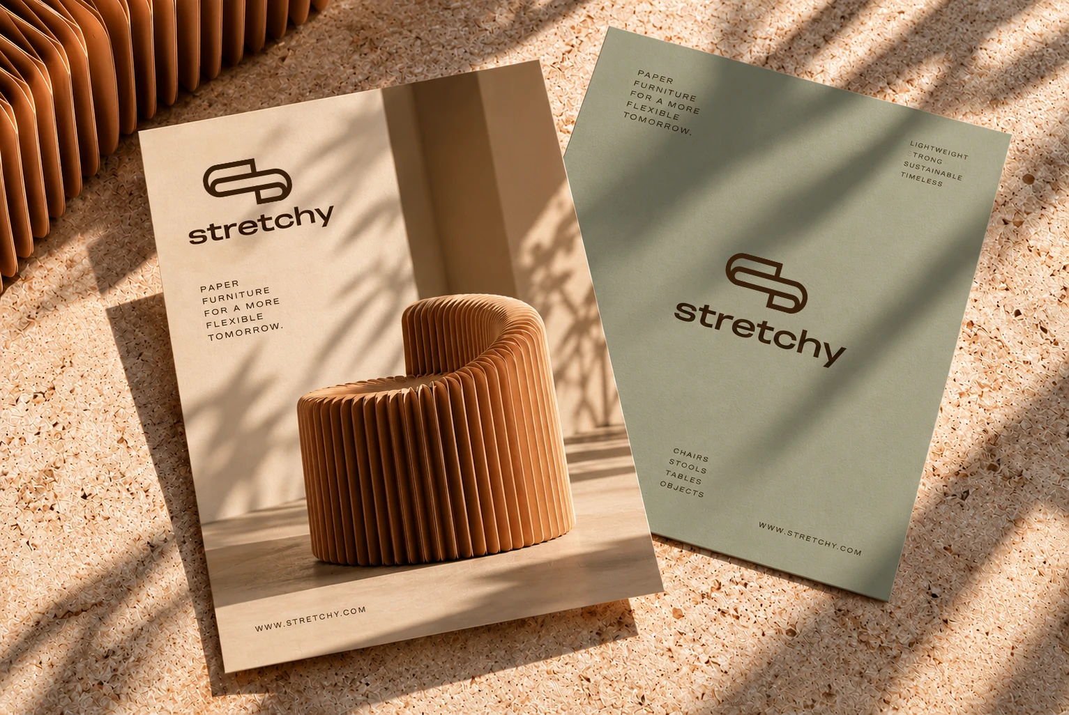
Furniture visuals: partly AI-generated for portfolio presentation, partly courtesy of Stretchy.