

Kibrit
Kibrit is a Bulgarian lifestyle subscription box that delivers a monthly selection of cosmetics and beauty products to its customers, presented as “happiness in a small box”. We refreshed and reworked the Kibrit logo, created the packaging design for their boxes and designed the UX/UI of their new online store. Together, this turns the brand into one complete experience, from the first visit to the website to the moment the box is opened.
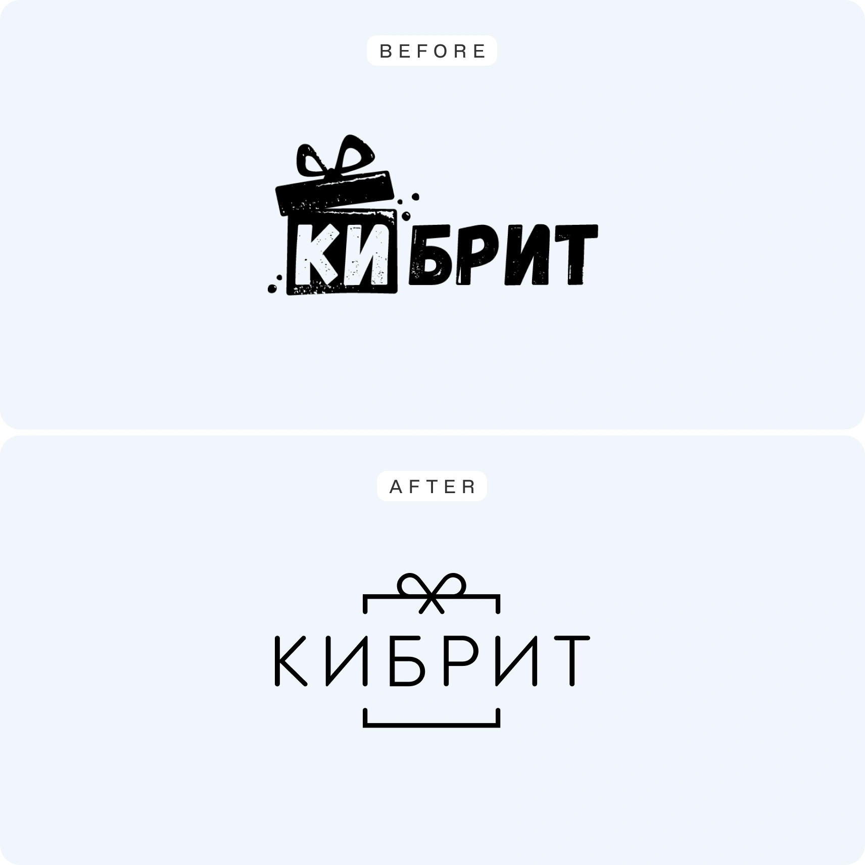
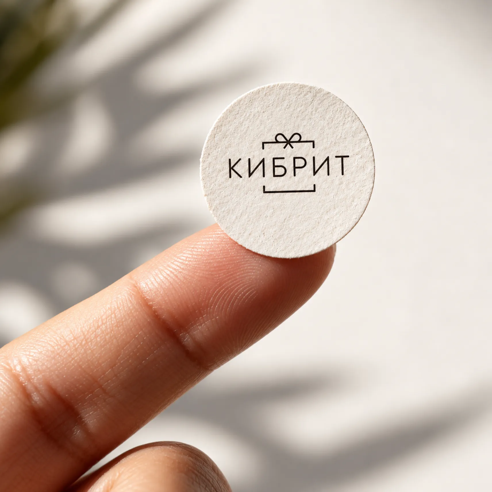
Kibrit already had a recognisable name, but its visual identity needed an update to reflect how the brand had grown. We refreshed the logo, keeping the signature gift box with a bow, but made it cleaner, lighter and more modern, so it looks just as good on packaging, social media and screens.
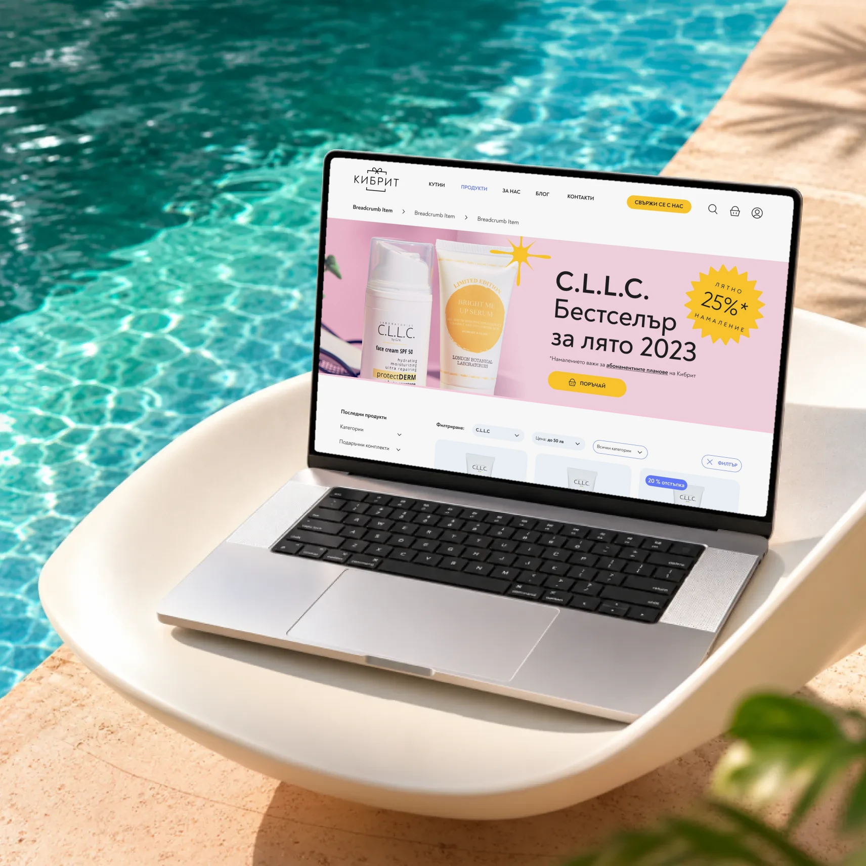
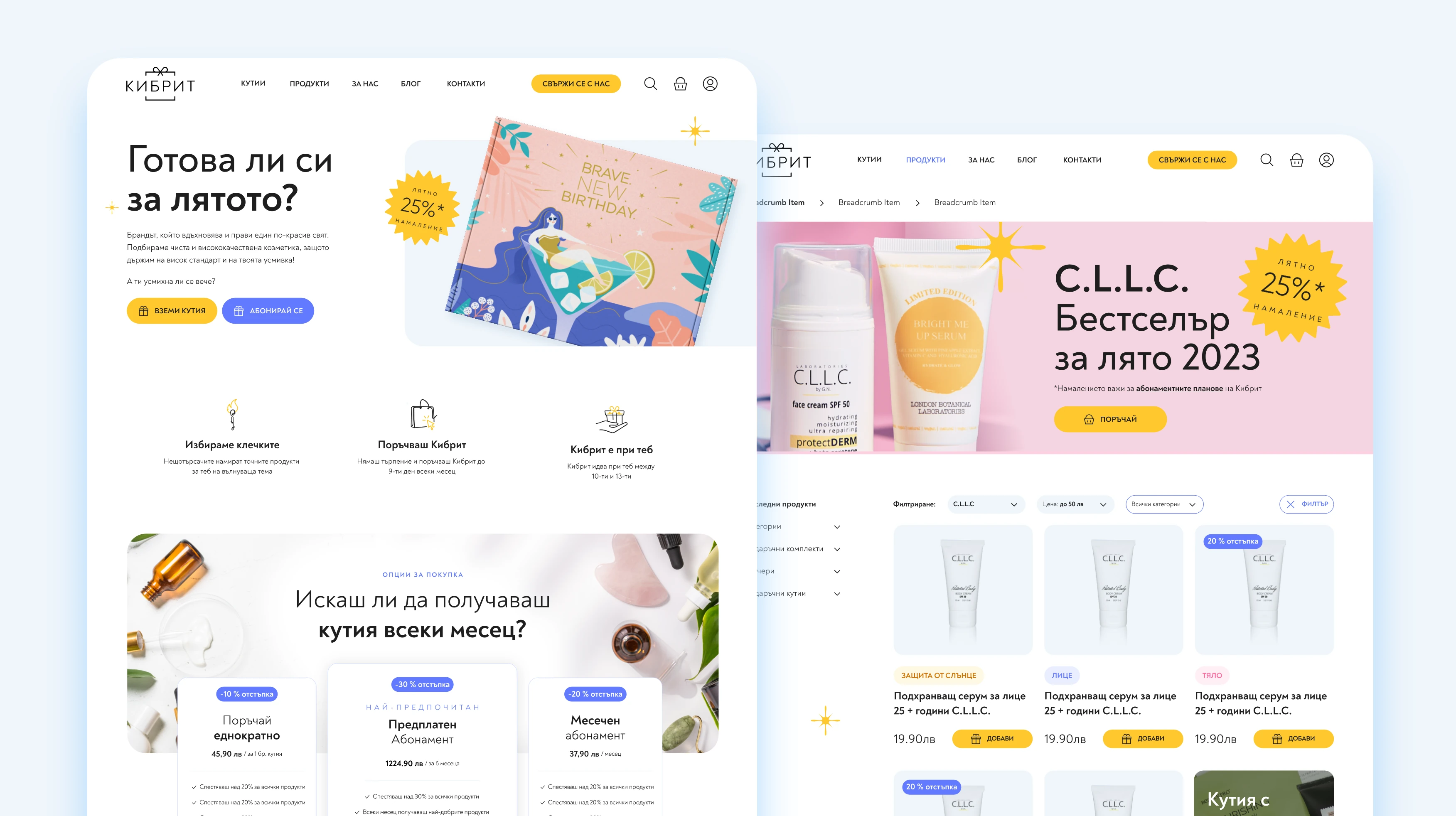
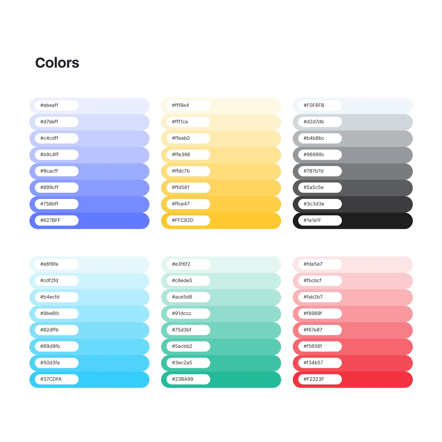
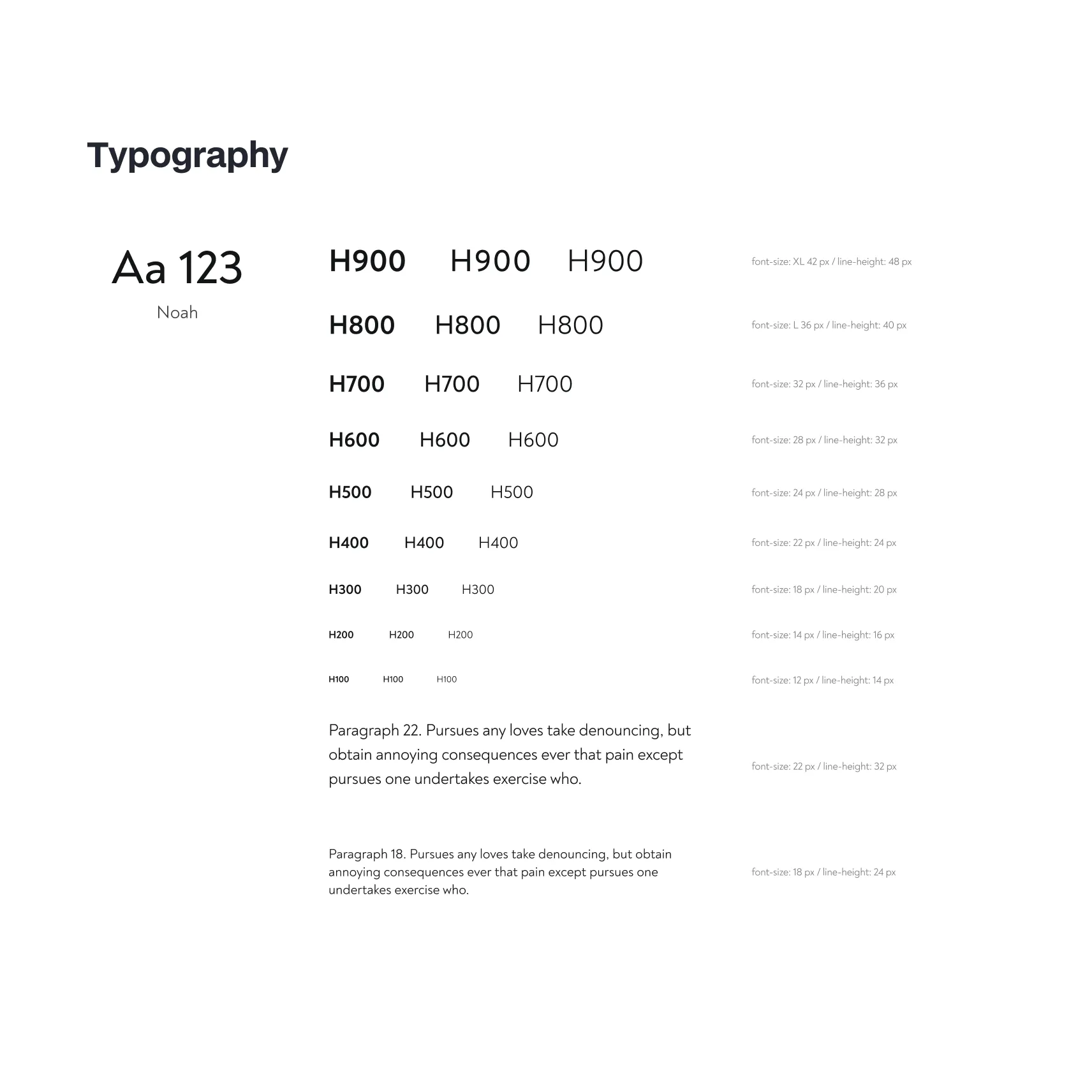
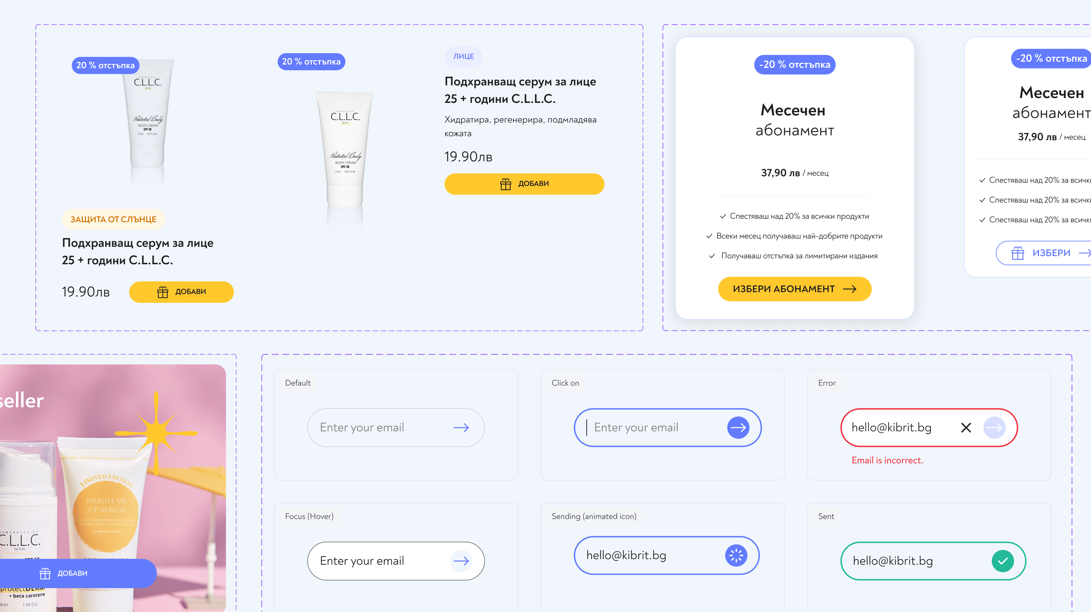
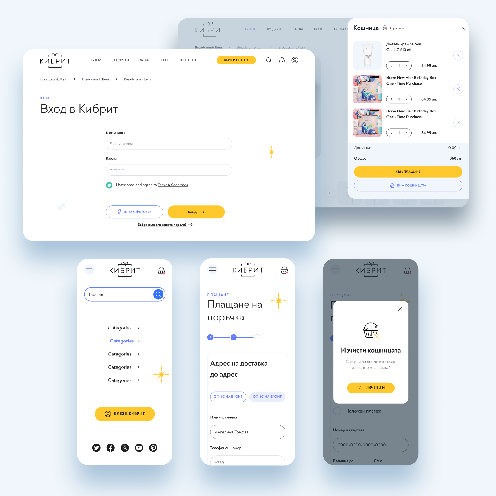
The new online store was designed for easy choices and quick ordering. We created a complete design system of colours, typography, icons and components that keeps the interface consistent and easy to build on.
- Logo redesign and refresh
- UX/UI design of an online store for subscriptions and one-time orders
- Design system: colours, typography, icons and components
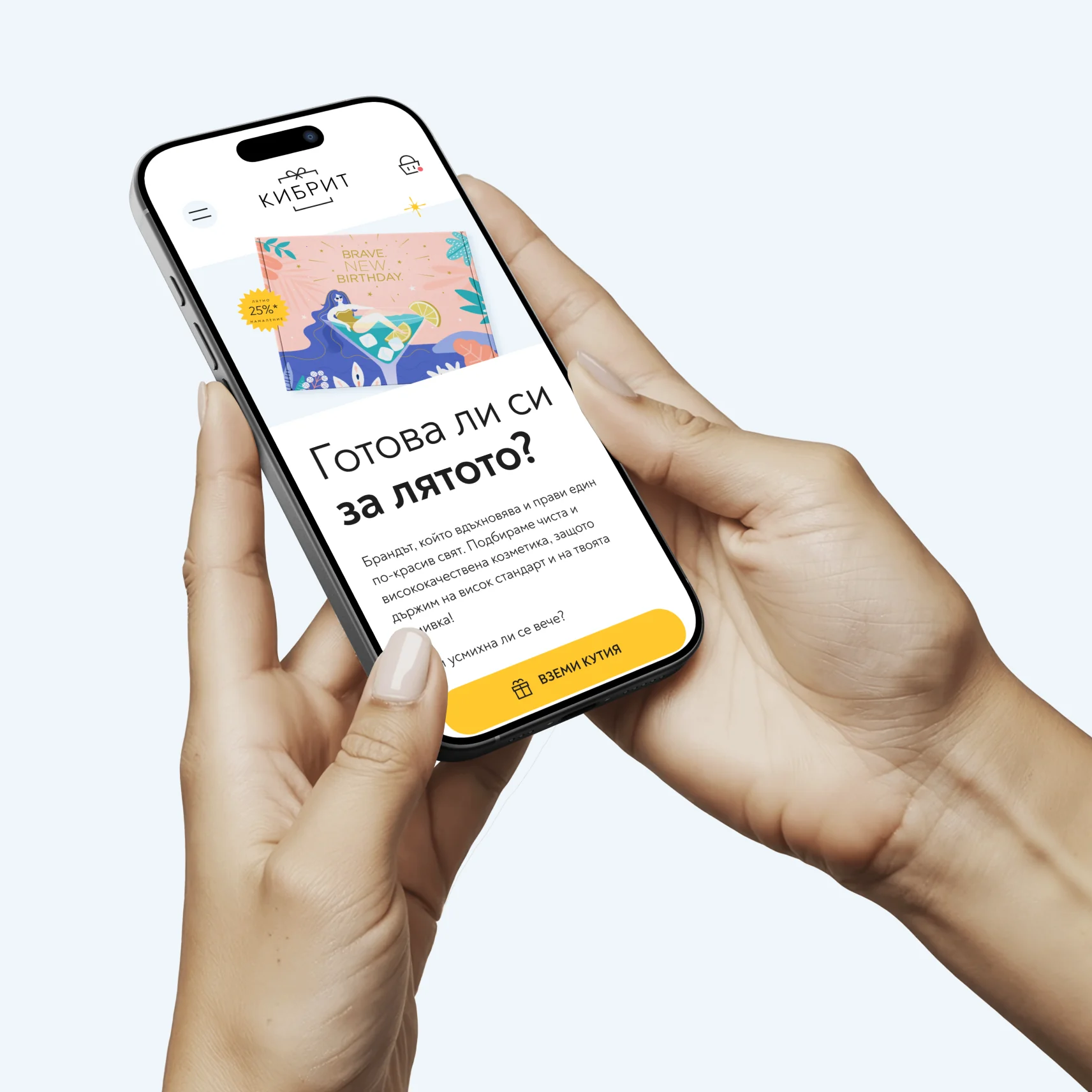
- A mobile-first experience designed for shopping on the phone
Designing the Shopping Experience
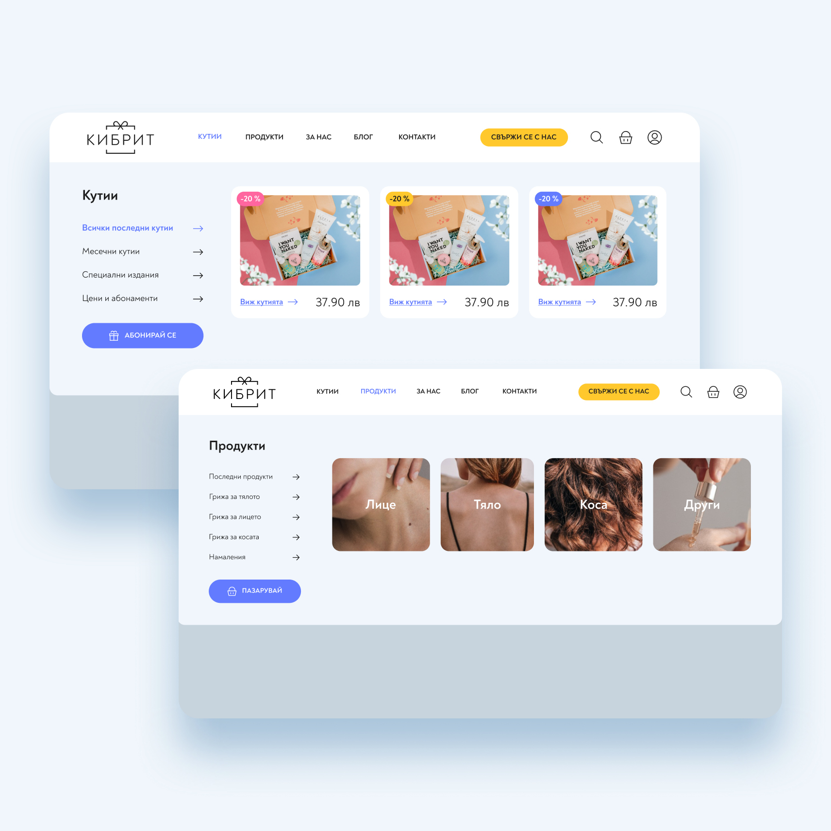
We started by researching how Kibrit’s customers shop: many buy a gift, while others choose between a one-time box and a subscription. Based on this, we mapped the main user journeys, from discovering the monthly box to choosing a plan, adding products and completing the order.
We then moved from wireframes to a complete interface, focusing on clear hierarchy, easy navigation and as few steps to checkout as possible. Every page was designed mobile-first, since most customers shop on their phones. The result became a scalable design system, so new boxes, products and campaigns can be added without reworking the site.
- Wireframes and information architecture
- Mobile-first UI design
- A scalable design system with reusable components
Custom Illustrations
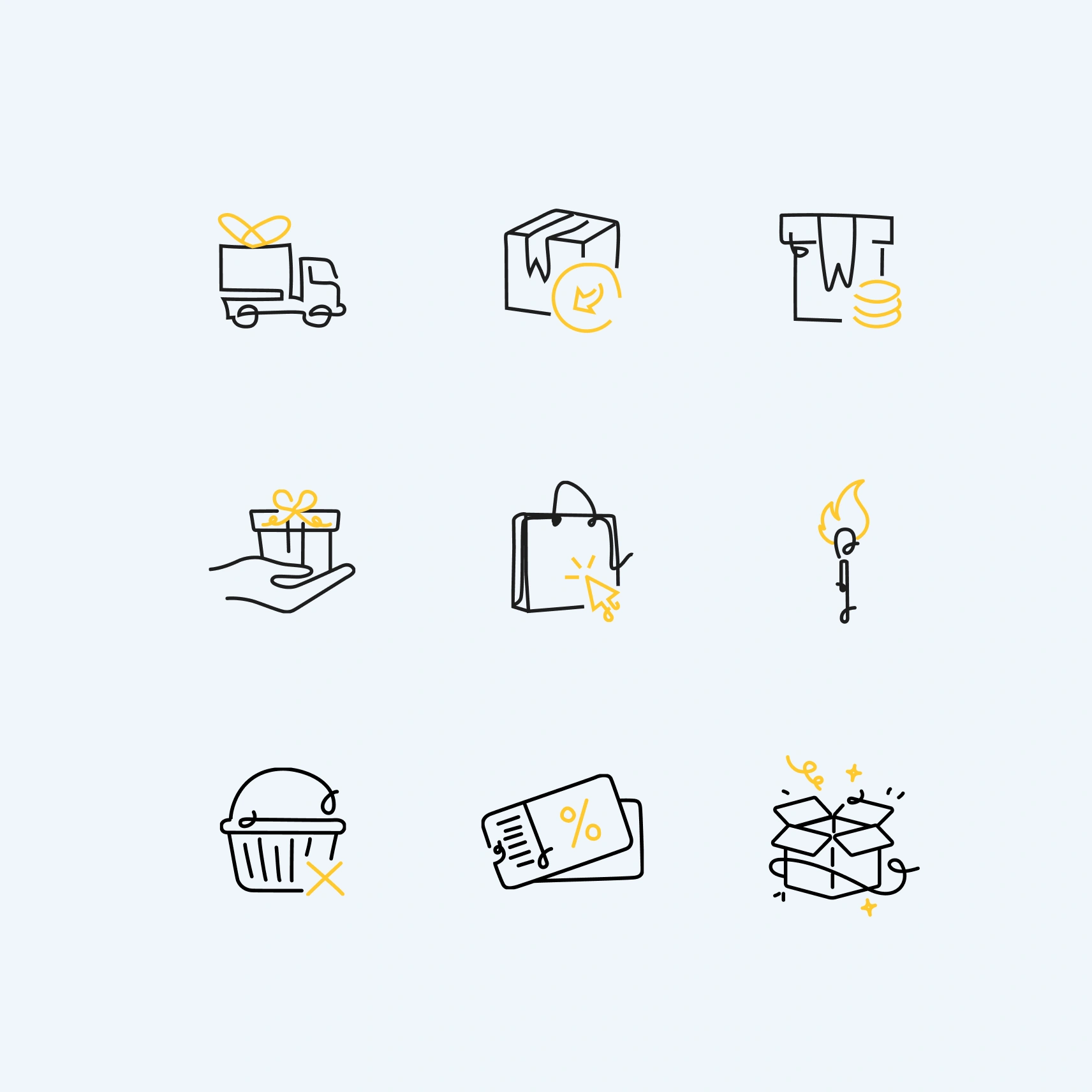
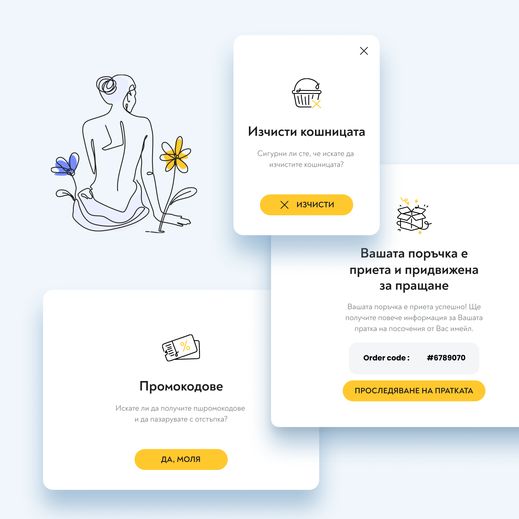
Illustration is at the heart of the Kibrit brand. Instead of stock graphics, we created custom illustrations that give every touchpoint its own warmth and personality. A set of hand-drawn line icons guides customers through the website, explaining how the box works, how delivery happens and what to expect each month.
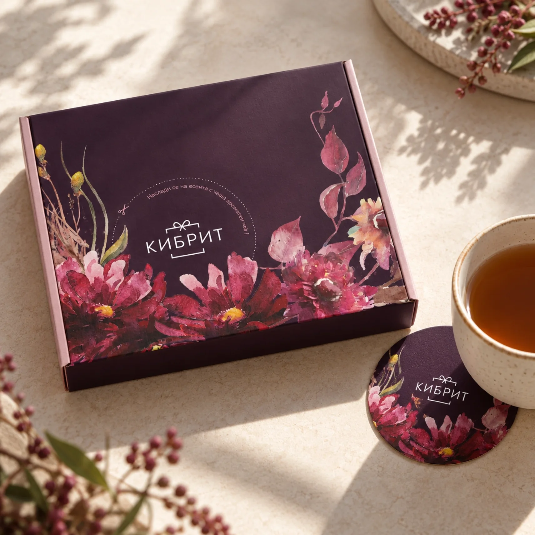
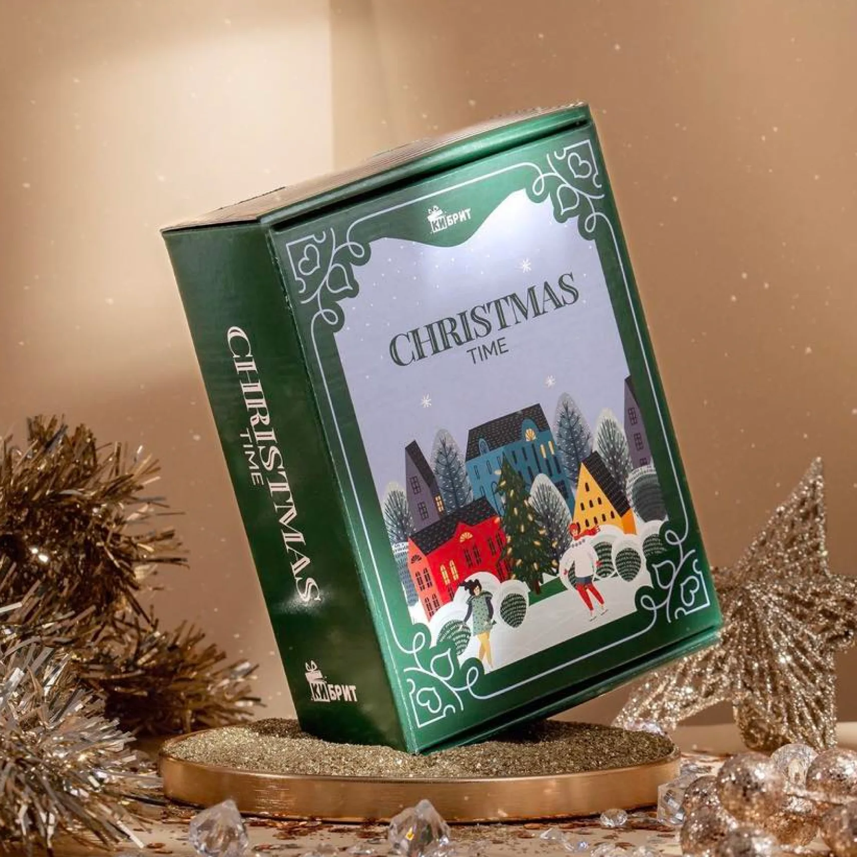
On the packaging, each collection got its own illustrated world: playful summer scenes, watercolour flowers for autumn and a detailed winter village for Christmas. Together they make every box feel like a small gift, even before it’s opened.
- A custom set of line icons for the website
- Unique illustrations for every seasonal box
- One visual style across digital and print materials

Packaging
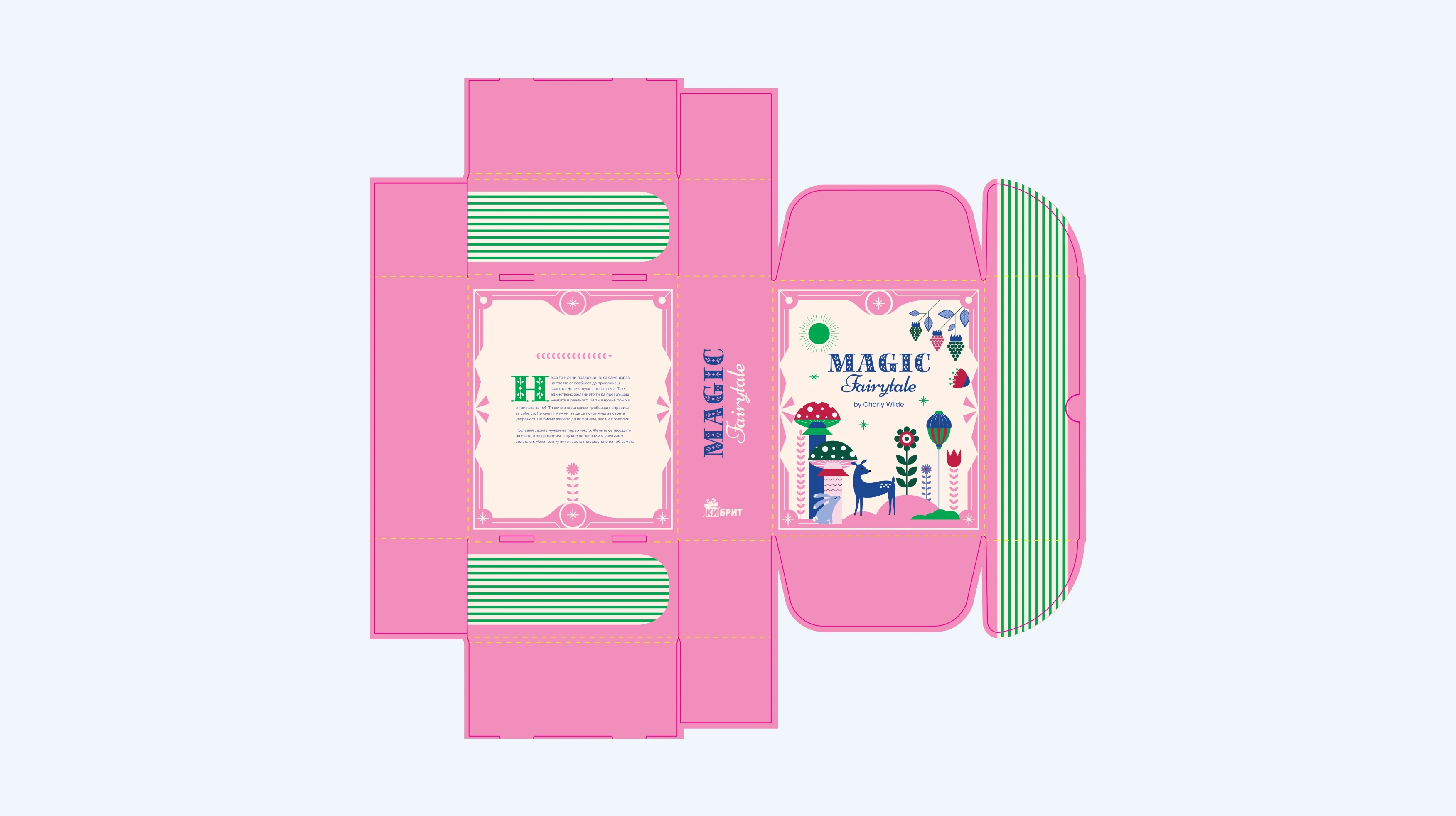
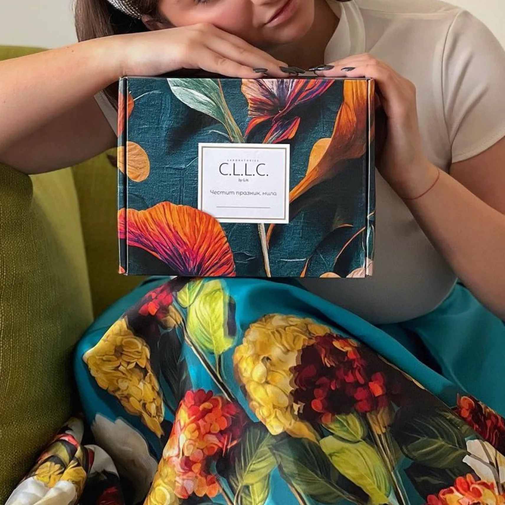
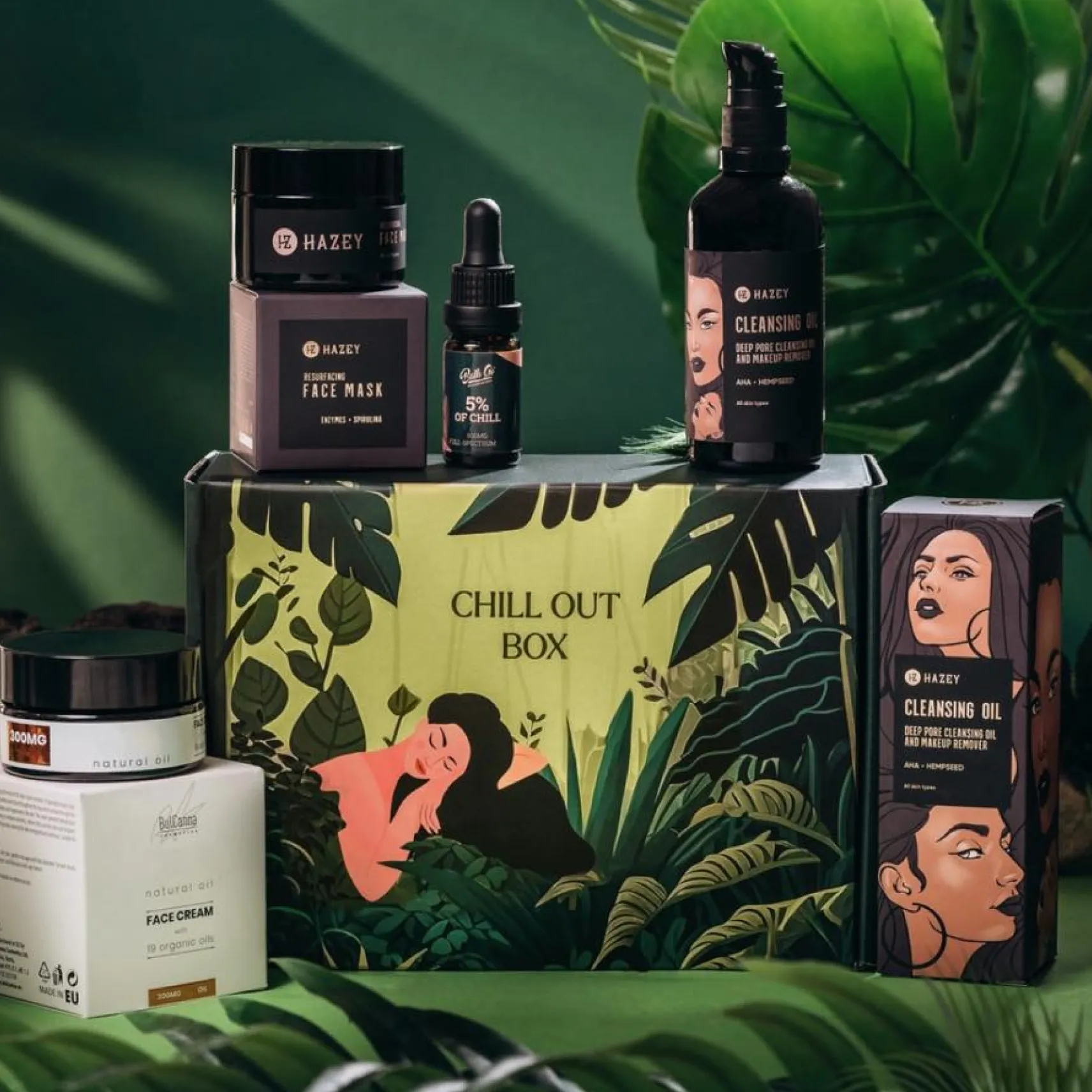
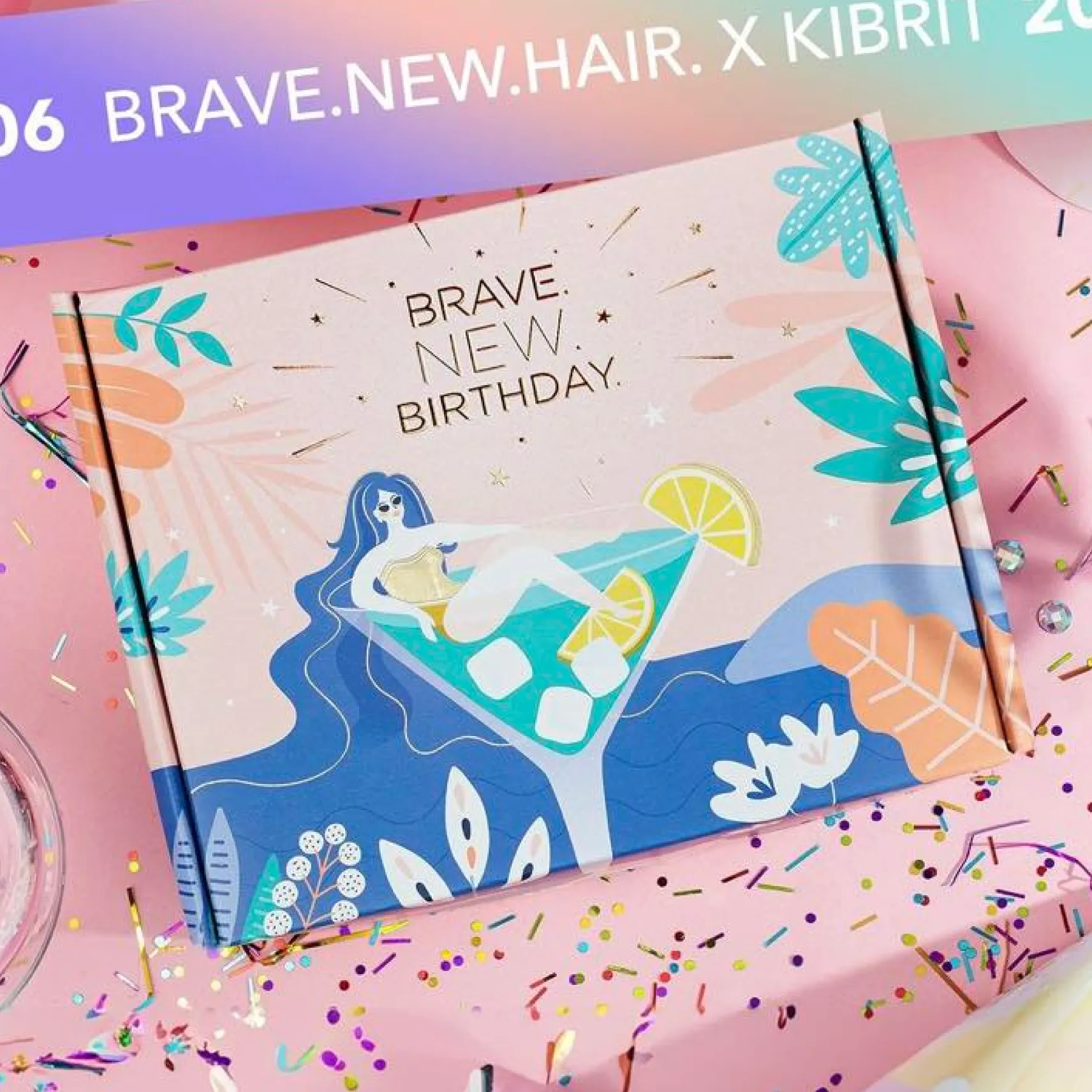
For Kibrit, the packaging is part of the experience: it’s the first thing the customer sees and opens. We created a series of themed boxes for different seasons and occasions, from autumn watercolour flowers and spring motifs to a festive winter village with gold foil. Each box has its own character, but together they speak the same visual language.
- Seasonal and themed box designs
- Illustrations and patterns created for each collection
- Print-ready artwork, including gold foil and special finishes
*Box photography courtesy of Kibrit.