

Project overview
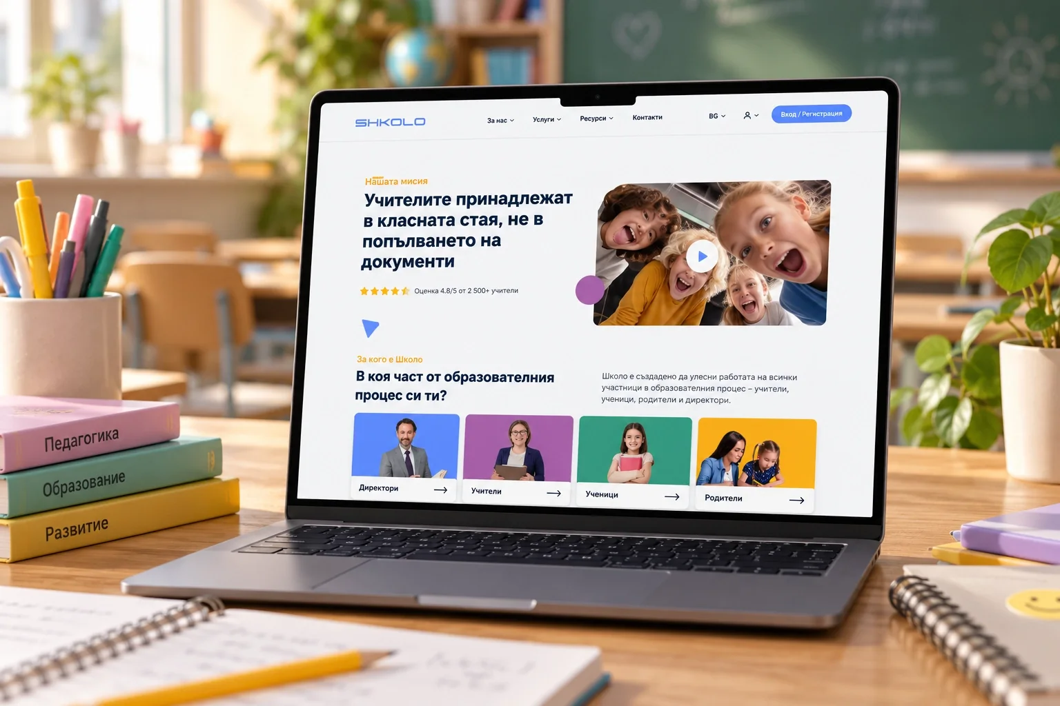
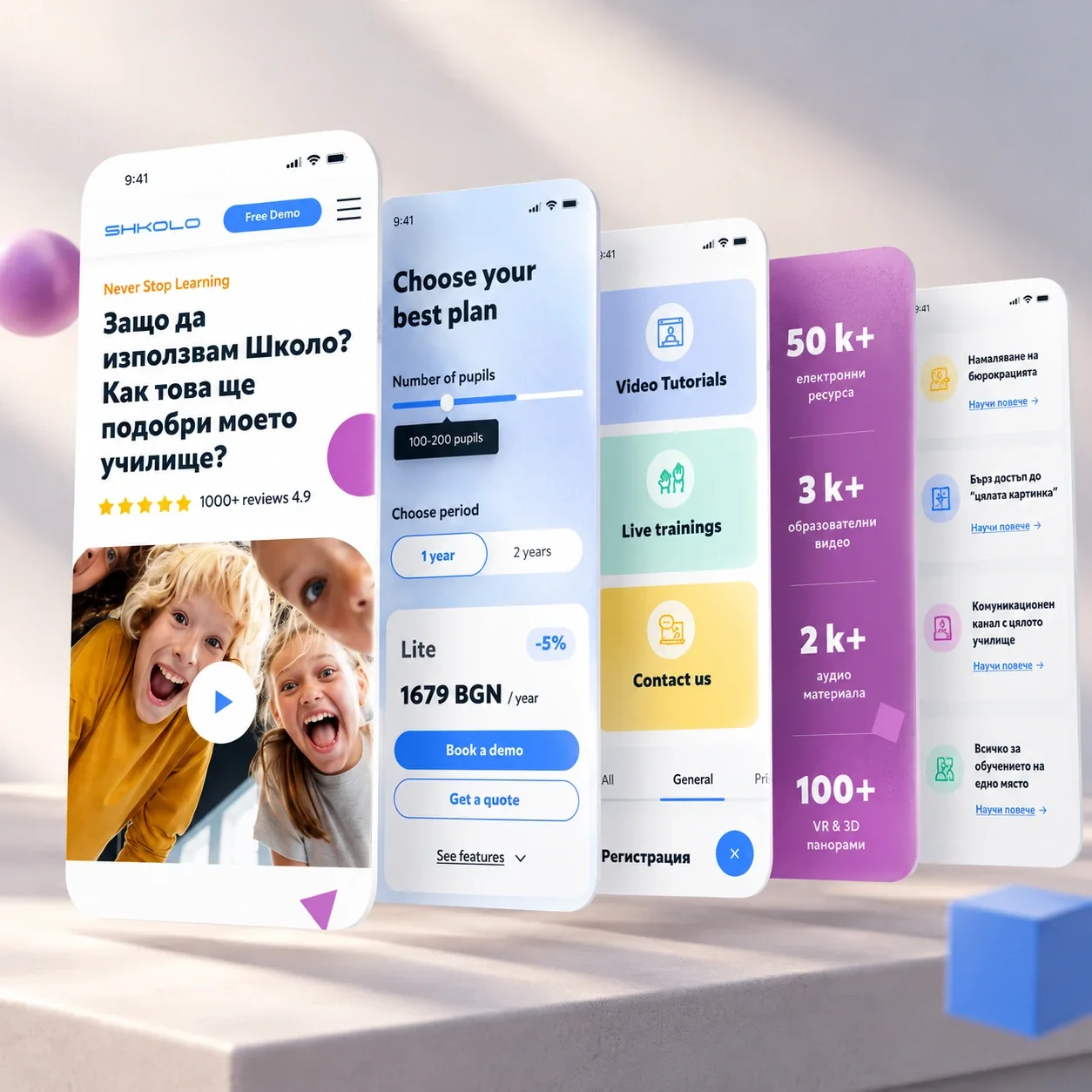
Shkolo is a digital platform used by thousands of Bulgarian schools. It brings the e-gradebook, school administration, communication and learning resources together in one place. When the company decided to expand its service abroad, starting with the Spanish market, it needed a website that could explain the platform quickly to schools that had never heard of it.
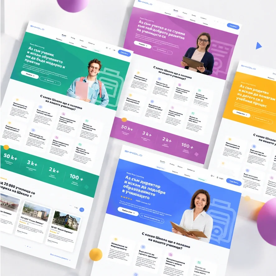
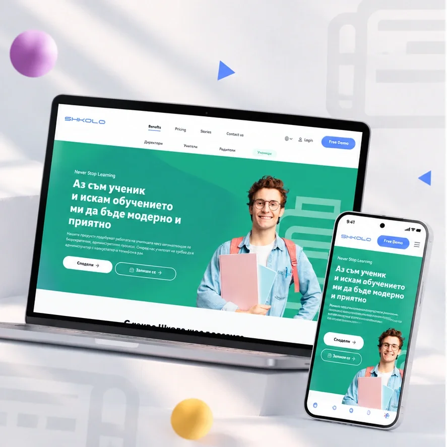
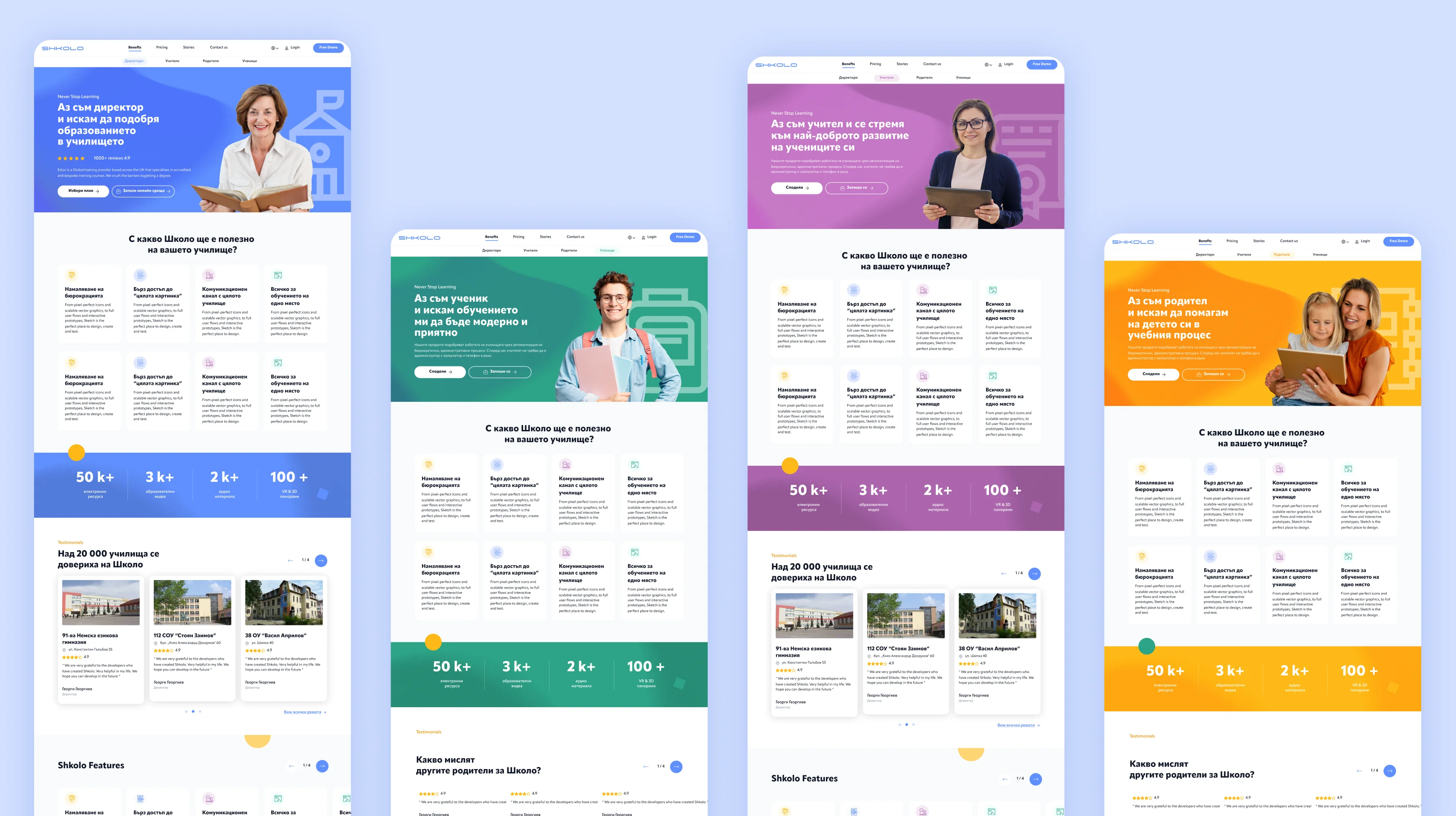
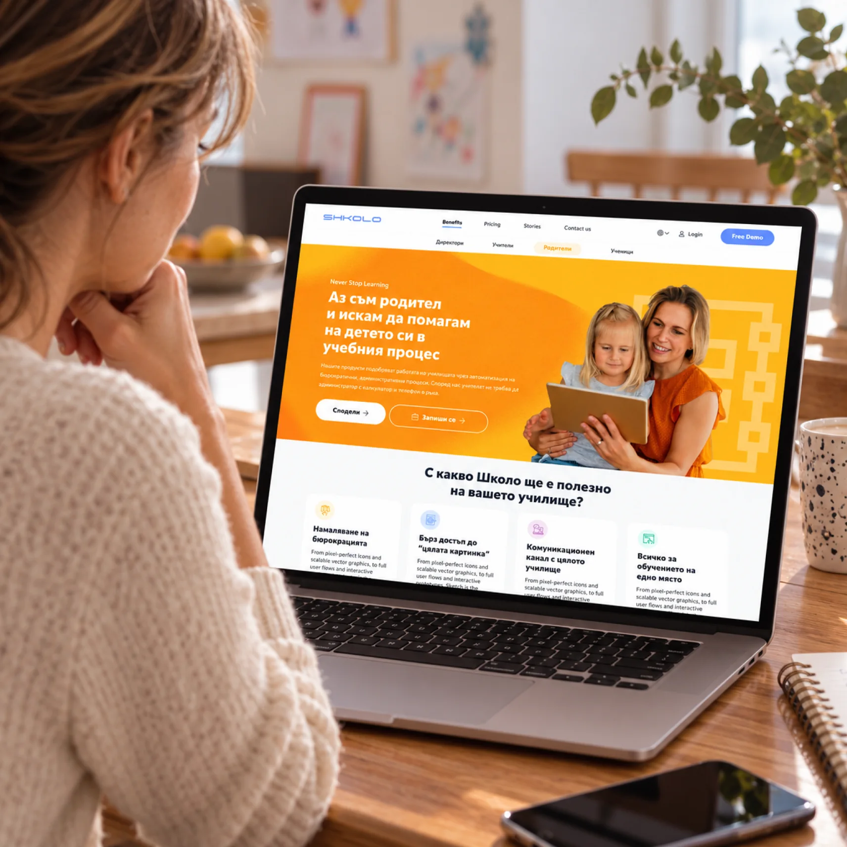
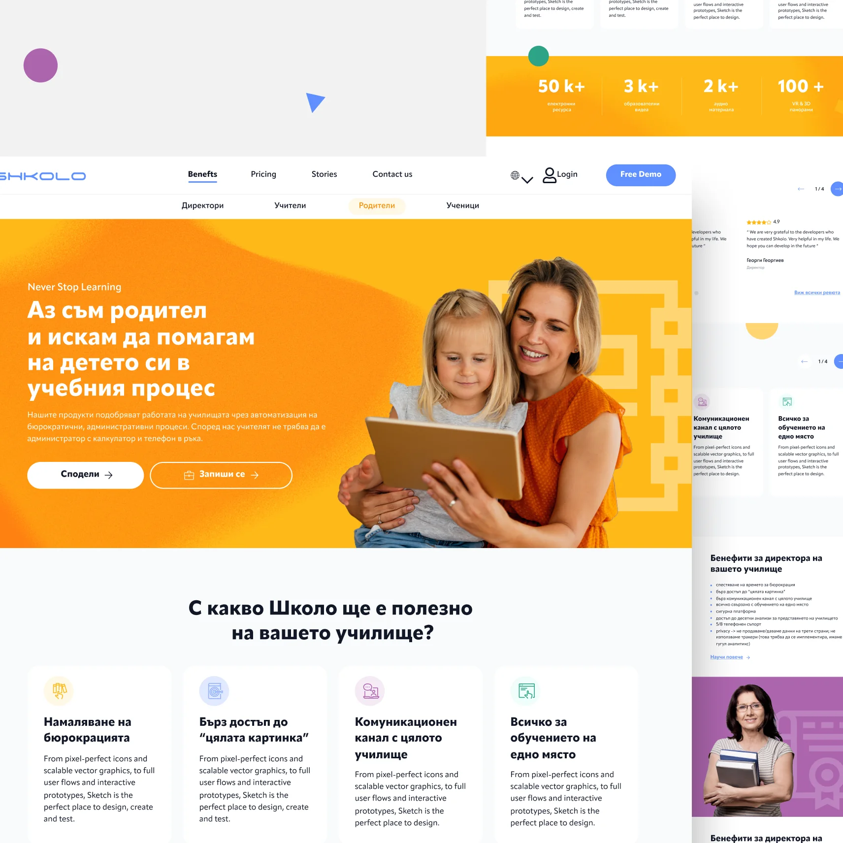
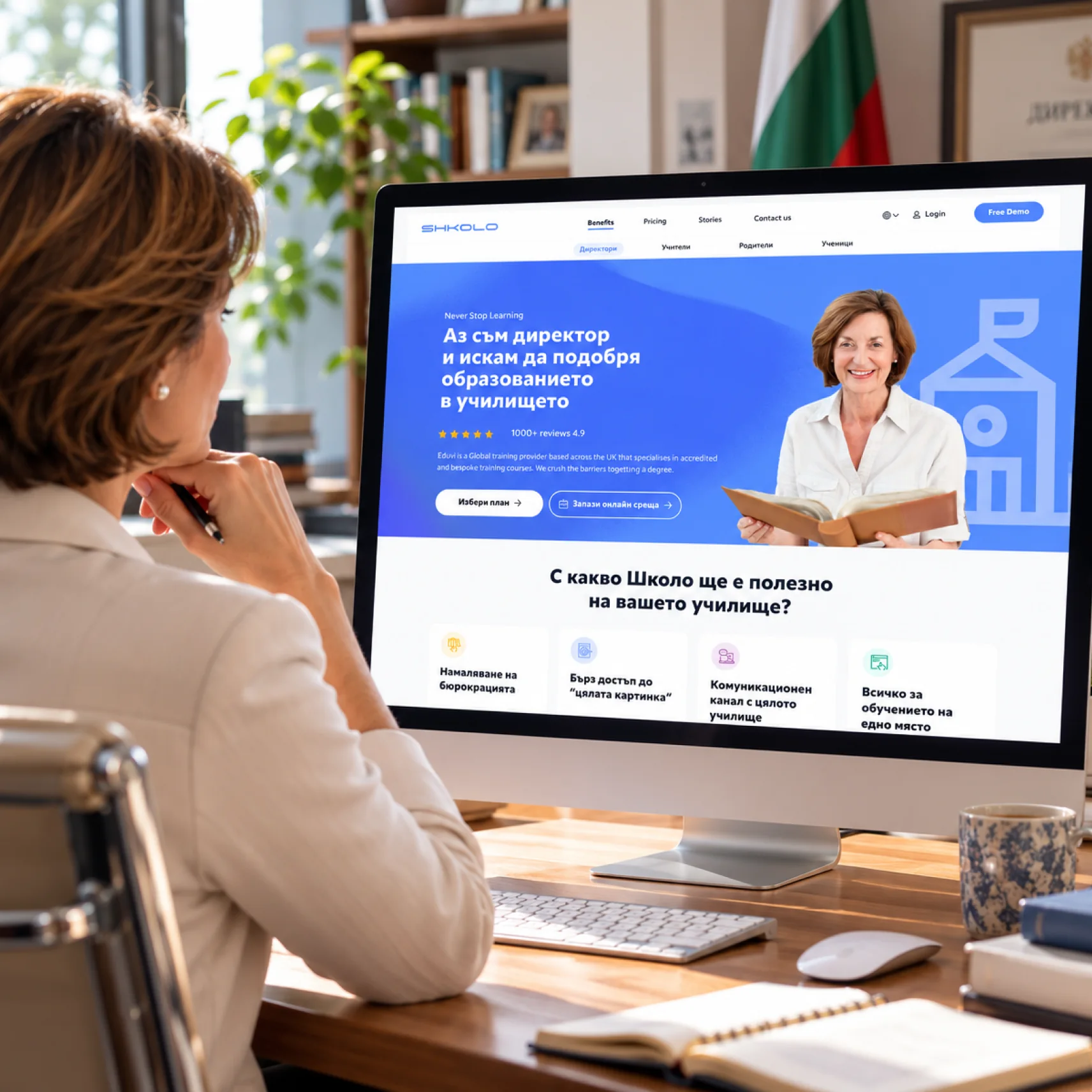
We built the experience around one simple question: “What part of the educational process are you in?” Directors, teachers, pupils and parents each get their own page, colour and message, focused on the benefits that matter to them: less bureaucracy for directors, more time with students for teachers, modern learning for pupils and a closer view of school life for parents.
- Personalised landing pages for 4 audiences, each with its own colour
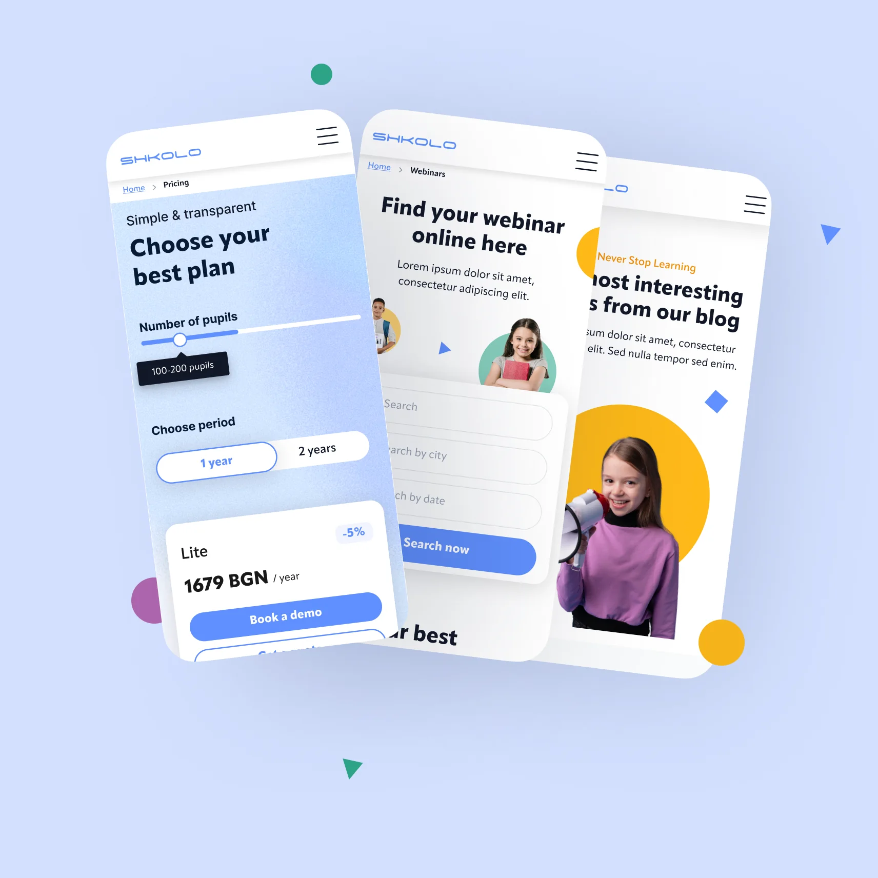
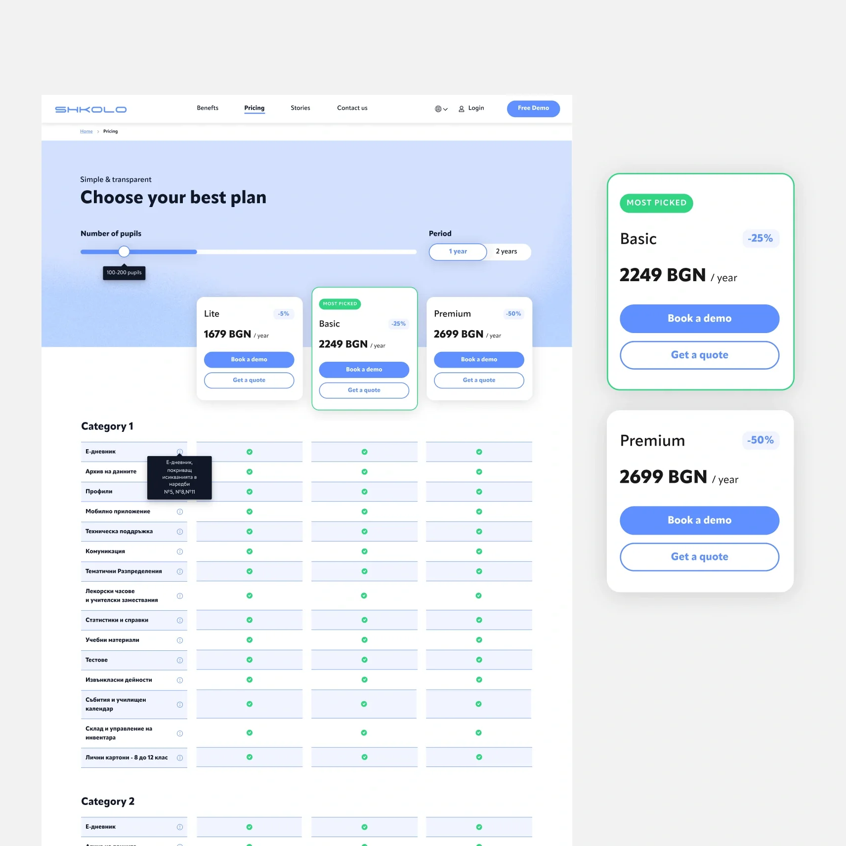
- Transparent pricing with a pupil-count slider and plan comparison
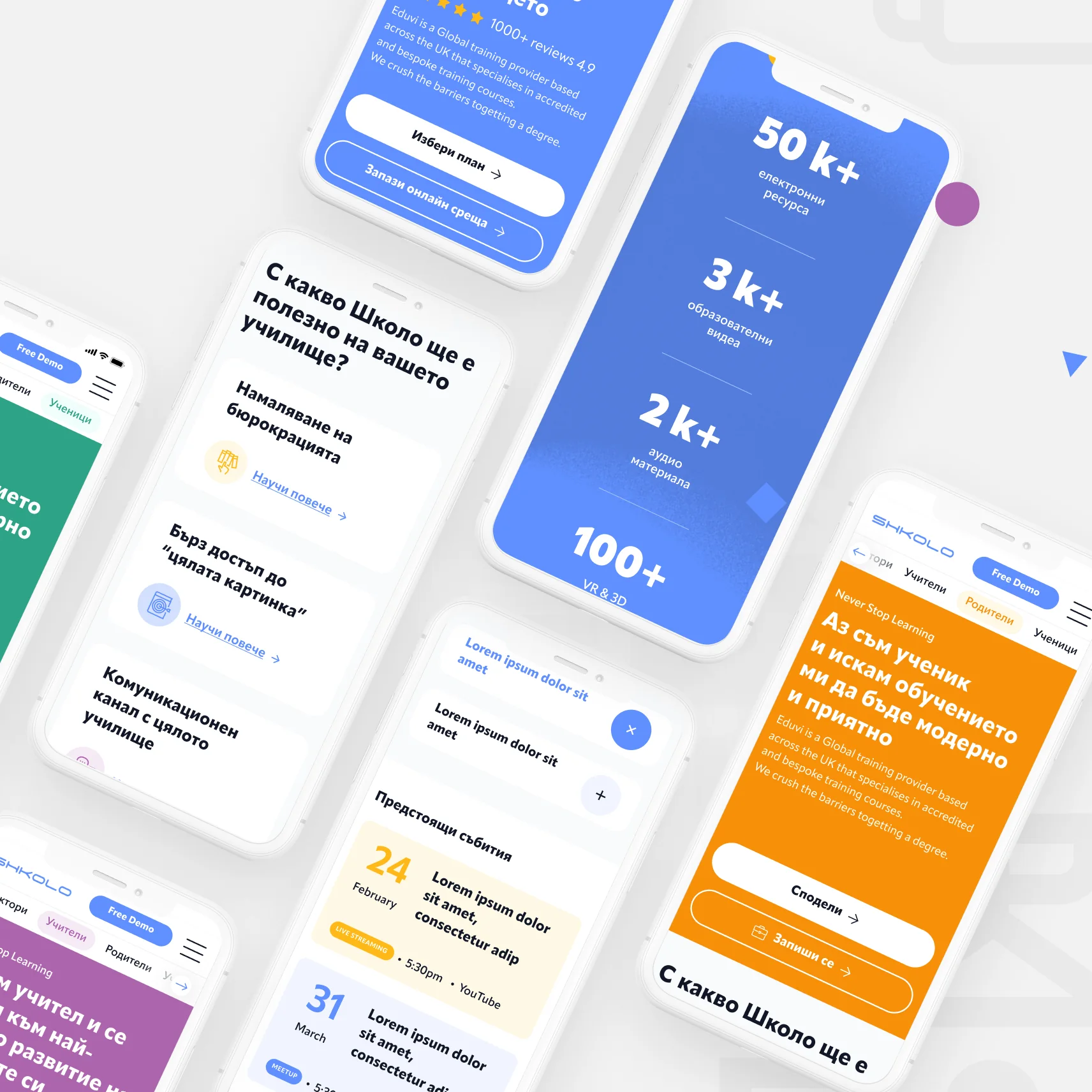
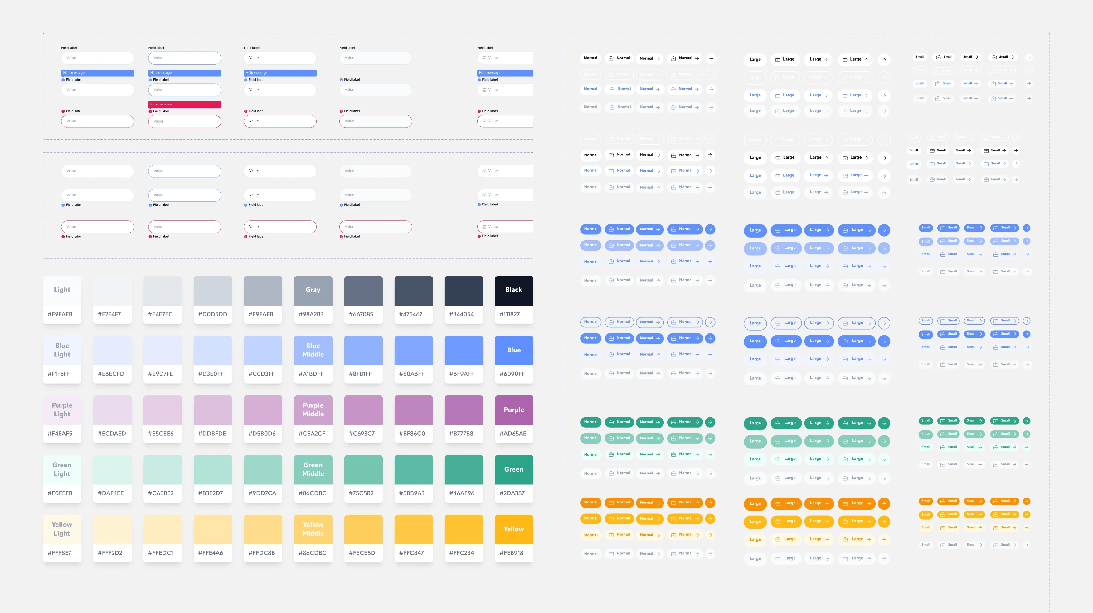
- A complete UI kit, from wireframes to responsive desktop and mobile design
Wireframes
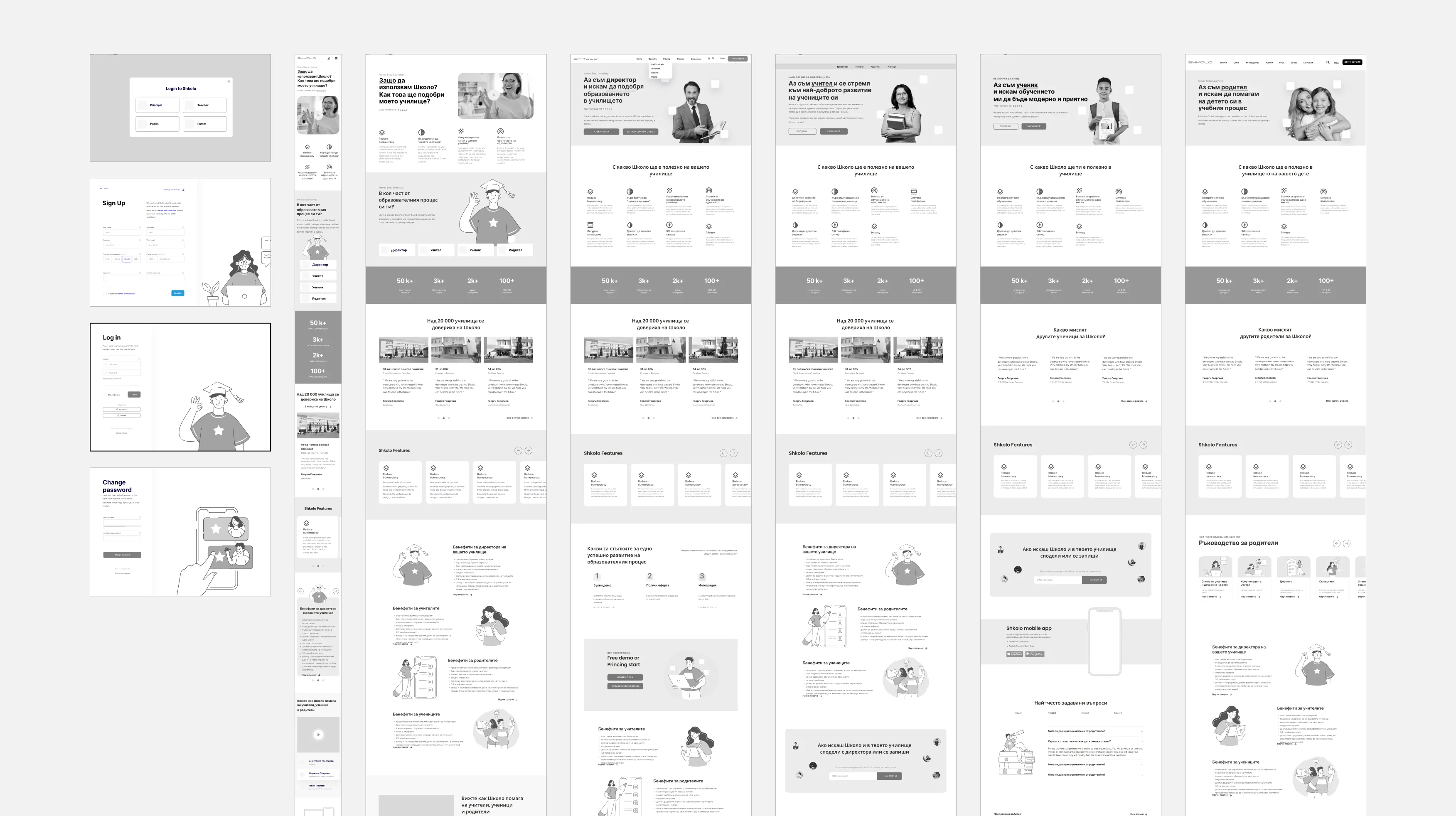
We started with wireframes for every key screen: login and sign-up, the main landing page and a dedicated page for each audience. This let us test the flow and the content before adding a single colour.
Components & Banners
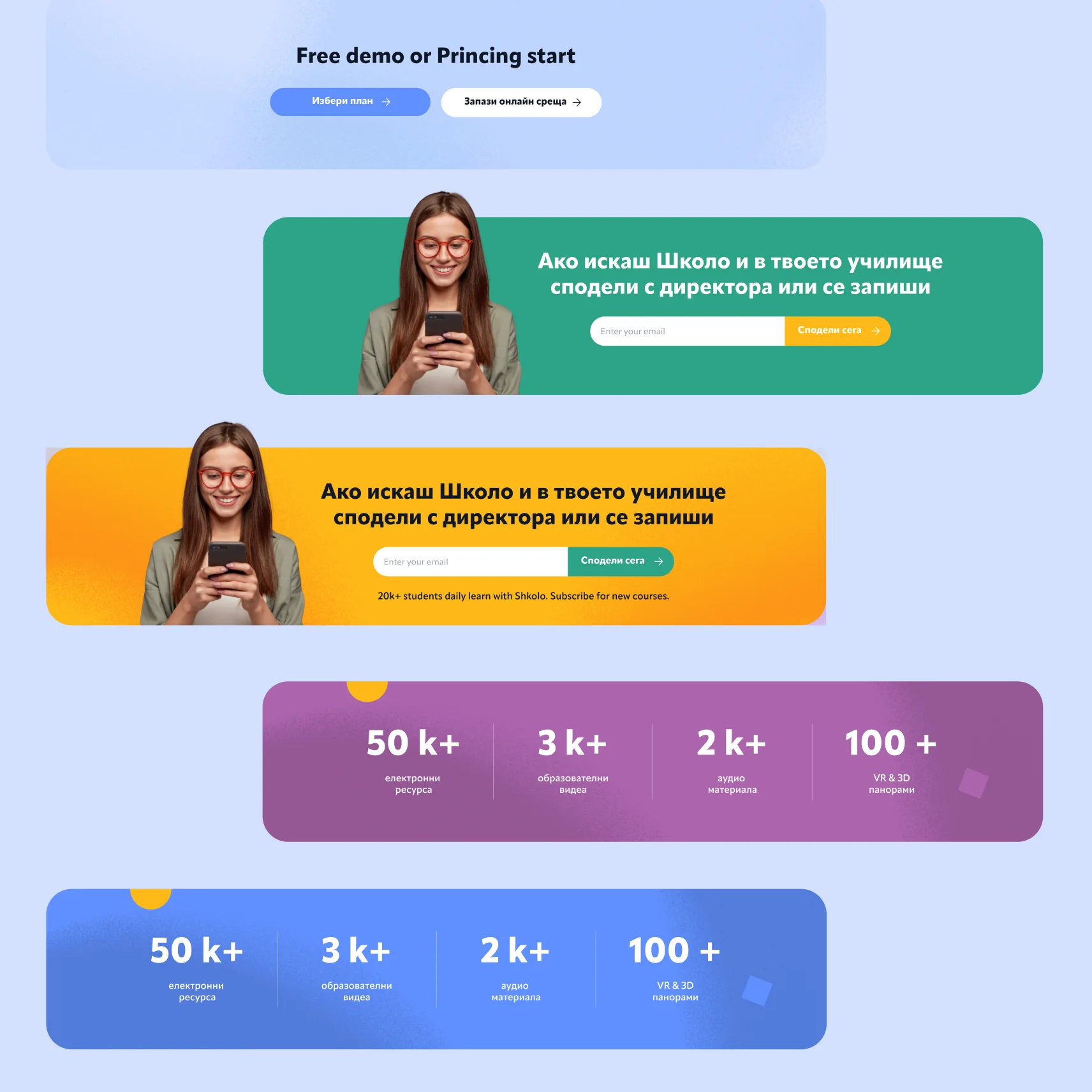
Call-to-action banners, stats sections and sign-up forms were designed as flexible components. They switch colour to match each audience, so every page feels personal while staying part of one system.
Landing Pages
Each audience gets its own colour and voice: blue for directors, purple for teachers, green for pupils and yellow for parents. The structure stays the same, so the site is easy to grow and maintain.

The landing page was live on shkolo.com for a couple of years as part of Shkolo’s international expansion and has since been taken down. An archived version can still be viewed via the Internet Archive.